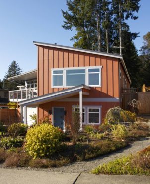
 The trend toward abandoning grassy front lawns in favor of perennial beds and vegetable gardening is taking hold, and none is more breathtaking than what Anne and Bob Knapp have created.
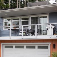
Their two-story, custom home in Gig Harbor graces the irregularly shaped lot on which it is built, provides a colorful approach to the concept of modern landscape, and is wholly designed with the idea of allowing the couple to “age in place.”
“We looked after both of our sets of parents as they reached their elder years and faced various infirmities,” Anne Knapp explains. “It became obvious to us we should design our new home as obstacle-free as possible, so we can stay here as long as we like.”
Residents of the Cromwell area since 1986, the Knapps yearned to live closer to town, as the “walkability” of a neighborhood was high on their list of desirable properties. They discovered their present homesite the day it went on the market and even though it is a “quirky shape and elevation,” Knapp says they knew immediately it was the perfect spot for them.
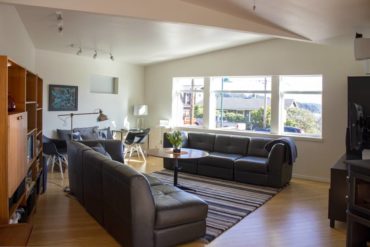
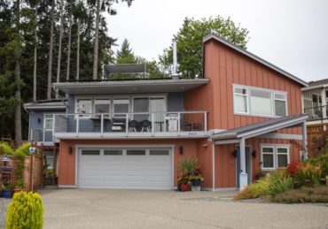 Perched on the hill overlooking Gig Harbor, this property filled nearly every square on the couple’s want list. They have an iconic view of the harbor and Mount Rainier; can easily walk down the hill to restaurants, shops, galleries and museum; and were able to design the home on two main living levels connected by an elevator and a stairwell. The only steps in the entire home are contained in this connecting stairwell.
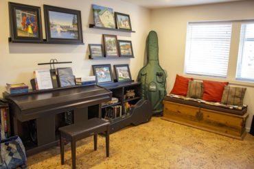
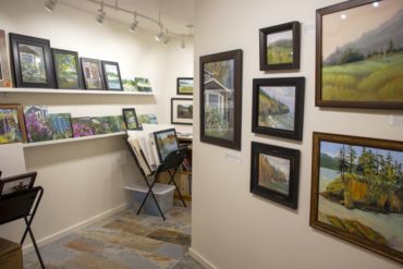
The downstairs level of the home opens onto the driveway and street. Knapp’s art studio opens onto a long gallery hall where she is able to exhibit her paintings. There is also a music room downstairs to accommodate her husband’s hobby, as well as a downstairs master bedroom suite. This room presently serves guests, but could also be used by a caregiver at some point in the future, if needed.
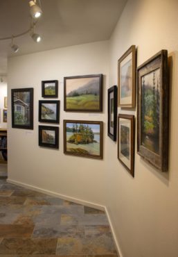
Knapp, a well-known local artist thoroughly immersed in the Gig Harbor arts community, is also an avid gardener. She has chosen the type, texture, color and variety of each plant in the front and side gardens, as they are seen from the street, to complement the exterior colors and design of the house.
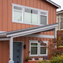
A two-tone color scheme of terra cotta and slate blue enhances the exterior of the modern architectural design. “Essentially, two boxes built together but slightly offset from one another combine to make the overall structure,” she explains.
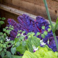
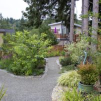
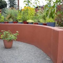
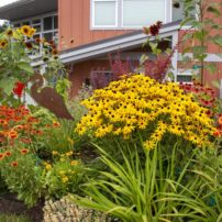
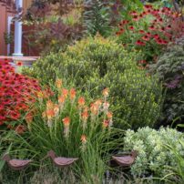
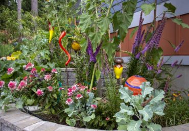
Complementing the terra cotta section that is nearest to the street, the front perennial bed on the right side of the drive explodes in the brilliant hues of golden sunflowers, bright-orange coreopsis, deep-yellow rudbeckia and scarlet echinacea. Chartreuse grasses, burgundy flax and variegated hebes with little purple blossoms, along with a drift of iris reticulata, serve as a counterpoint to the hot colors in the heat of summer. A clump of red-hot pokers are a backdrop for a family of rusty metal ducks that appear to be floating on a sea of the low-growing, blue-gray thyme border.
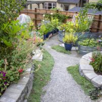
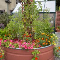
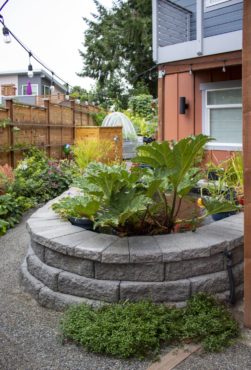
 On the left side of the driveway, stock watering tanks serving as raised beds are painted to echo the colors of the house. These hold combinations of flowers and edible plants, and are artistically arranged to fit into the overall visual scape, but also allow access to a gardener if seated.
The tanks sit on fine gravel, with pathways between them wide enough to accommodate a wheeled cart or even a wheelchair or walker. At 24 inches in height, the tanks also prevent wild bunnies from ravaging the crops within.
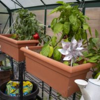
 An extensive drip system eliminates the danger of tripping over a hose. Bamboo trellises and wooden garden obelisks mounted in the raised beds serve as vine supports and give the tank arrangement a vertical appeal. Tucked neatly behind the array of raised beds, the greenhouse is conveniently located to allow for storage of tender plants in winter, but also for starting seeds in spring.
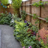
Gravel pathways flank both sides of the house and are planted with hardy perennials and shrubs. Shrubs and flowers that are planted in the front garden continue along the pathway on the terra cotta side of the house.
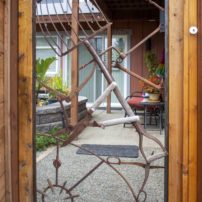
 Space allows a bit more room on the other side of the building, where a decorative gate welcomes the homeowners and visitors into the back garden. Here, natural galvanized finishes are left on the stock tanks, which overflow with every imaginable type of garden vegetable and small fruit.
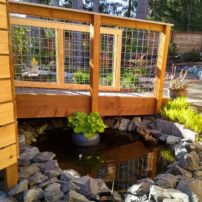
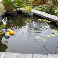
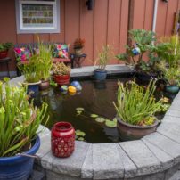
Stone walls complement the tank arrangement, while nestled into the space at ground level is a small pond that features pots of water-loving plants, and a surrounding wall is designed for sitting.
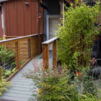
 This backyard area offers respite from the sounds of the road and the city, as well as serving as a haven for birds and a storage space for the wood pile. Access to the backyard from the lower level of the home is provided by a long, sloping ramp designed to accommodate a wheelchair.
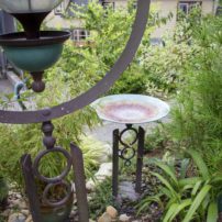
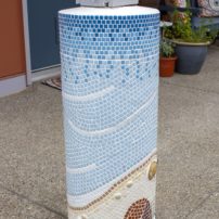
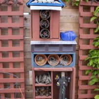
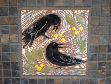
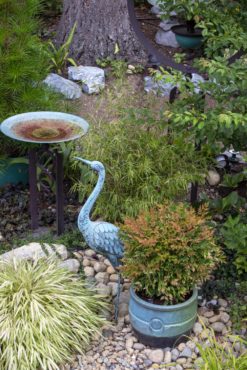
Artistically placed in every nook and cranny of the property are pieces of original art work. There is garden glass from Studio Rynkiewicz, a bird feeder and bird bath by Tom Torrens and ceramic embellishments on the front porch columns made by Patti McQuillin, to only name a few. A forged gate of gardening tools, bird feeders, a noble crane, a creative insect hotel and glazed ceramic pots, along with numerous other embellishments, are tastefully placed to enhance the plants and the layout of the entire garden area that surrounds the home.
Anne and Bob Knapp worked closely with designer architect Rhene Johns to create the plan for their house and property. The Knapps had an extensive list of wants and needs for their new home, which they crafted during years of looking after their own aging parents.
 They engaged in exhaustive research as to what types of energy and waste systems were appropriate for the environment as well as being economically sound. Building began in 2015 and took about a year to complete.
Paramount in the overall design and building approach was energy and resource conservation. Johns is a student of “Passivhaus,” a building concept pioneered in Germany and now being applied internationally. Translated to Passive House in the United States, the building process incorporates multiple principles to ensure lack of energy loss; conserve the integrity of indoor air quality; and utilize natural resources such as sun, rain and wind on the building site to complement the mechanical systems within.
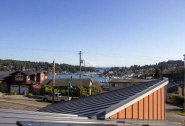
The south-facing roof on the main part of the house accommodates an array of panels for an active solar system, allowing not only cash saving for electric usage, but also selling excess power back to Peninsula Light Co. via the grid.
Rainfall on the house and property is infiltrated through pervious surfaces, preventing excessive runoff. The entire house is double-walled for insulation purposes to prevent heat loss and save energy, and the triple-paned windows are “thermally broken” to avoid temperature transference around the frames.
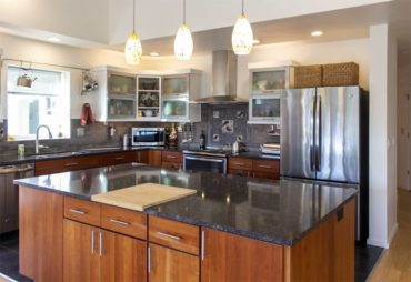
LED lighting is used throughout the home, and light fixtures were chosen according to the needs in each room. Tracks in the kitchen, living room and gallery provide targeted task lighting where needed and flood the walls in specific areas to highlight the extensive art displays.
 “Not only does LED lighting give us much more brightness for the amount of electricity required, but as we get older, we need better lighting for everything,” Knapp explains. “LED bulbs last longer and you can choose the color of lighting you desire, from daylight to soft lighting with a cool or warm cast.”
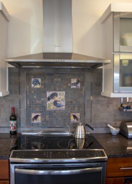
 The all-electric home is heated by a filtered HVAC system and augmented by an energy-saving, closed wood stove, for times when the electricity might be off. The kitchen induction cooktop not only saves energy, but a burner cannot be left on indefinitely because there are overheating sensors built into the system to shut if off automatically. This is an important feature for the aging-in-place aspect of the Knapp home.
 Kitchen storage was also thoughtfully designed, taking advantage of pullout drawers in the lower cabinets, for those times when the upper cabinets may not be accessible due to physical restrictions.
During the design phase, the Knapps tried to consider many other features they may come to need as they age. Every doorway measures 36 inches, wide enough to accommodate a wide wheelchair, in the event a family member in the future or a visitor should need it. A centrally located elevator enables anyone with physical infirmities to easily access the upper level of the home, as well as preventing the necessity for hauling heavy or bulky items up the staircase.
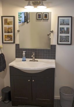
The master bedroom is designed large enough to accommodate bed-size changes as needed, and the master bath has a roll-in shower. A laundry chute allows clothing, towels and bedding to be dropped directly from the master suite into the laundry room below. A wheelchair-accessible sink is nice to have, and they located theirs in the upper guest bath so it is also available for guests. Every material and surface in the home was chosen for its sustainability and low-VOC qualities.
 The Knapps speak highly of their building contractor, Kelly Home Services — and particularly of Christopher, the lead project manager. The couple says he did a great job from the beginning, ironing out all the wrinkles of their innovative design.
Enjoying the view of mountain and harbor from the upper level, and looking down upon the colorful, artistically designed gardens surrounding the home, the Knapps are satisfied they will be able to age in place on their hillside perch for many years to come.


