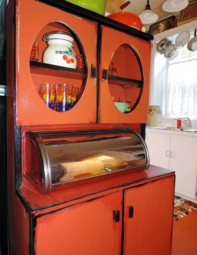
 Orange is a real monster — not intentionally, but a color that can sneak up oh, so slowly and not be the pillow-pal one might have expected.
“Confrontational” may be a more appropriate word. It is a love-or-hate color that balances on interpretation. Who doesn’t love pumpkin pie, but even tasty delights have limits.
This is where the “orange” story begins — limits. Too much orange is like dancing in stilettos, sexy at first but practical factors can change good intentions. Or maybe one could call orange as being like a corn-field maze where every turn brings unexpected results and feelings of being lost — one turn leading to another, leading to another, leading to another.
I went to Arnold’s Home Furnishings on Kitsap Way in Bremerton. The store is always up on interior trends, and merchandise manager Kathy Christensen has helped me in the past. But she shook her head when I asked about the color orange.
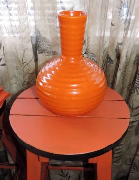 “Burnt orange or rust is trendy, but basic secondary orange is not a seller. Even artwork displaying any amount of the pumpkin hue does not sell,” she explained. “One thing about color — home decorating trends often follow clothing trends.”
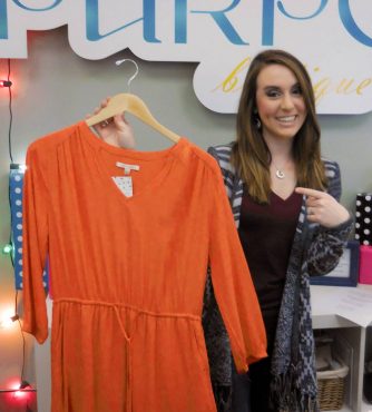
I then visited the award-winning business Purpose Boutique, a fashionable woman’s clothing shop in Bremerton. Looking around, I saw no orange; the closest was a bright-salmon-red shirt.
Jackie Ellwood, public relations and marketing director for Purpose Boutique, agreed that rust, burnt orange or burgundy are popular colors — but not orange. She added that there can often be a complexion conflict.
Next stop in the exploratory maze was Bremerton’s Hospice Thrift Shop on Pacific Avenue, a beautiful store with elegant displays. (Sadly, the shop has closed its doors since then.) Orange? Yes, it was everywhere, from tiger-pattern pajama bottoms to silky evening attire. This complicated the well-traveled maze. There were no orange clothing items in the shop with new merchandise, but lots of orange used items in the thrift shop. But that makes sense — past orange trends and purchases may be short-lived and easily passed off to secondary markets.
 On the subject of clothes, I contacted the Bremerton Police Department and the Kitsap County Jail, asking why prison jumpsuits are orange. I was quickly told that orange isn’t always the color. Kitsap County has dark-green prison attire. I think the person was surprised and a little tickled by the never-asked-before question.
The general consensus was visibility, which makes sense. It would be the same reason hunting vests are orange. In fact, Washington state law requires hunters to wear so many square inches of bright orange while hunting.
Award-winning photographer Elaine Turso introduced yet another direction of interpretation, that of being a seasonal association.
“I can’t see orange with black without thinking Halloween, and orange paired with brown and green means Thanksgiving,” she said.
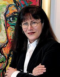
As the project dictated, a gallon of orange paint was needed to properly summarize things from an artist’s point of view. The Halloween hue was not a surprise, as I tackled it some years back, creating several paintings. While in the art gallery one day, I was working on a large, black-and-orange, abstract painting and made the comment, “I might as well throw pumpkin pie on this and sketch out a jack-o’-lantern face.”
 A visiting tourist, who just happened to be an interior designer, saw and heard my frustration. She told me to add white. I did — and problem solved.
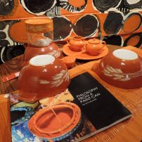
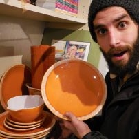
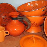
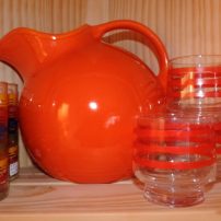
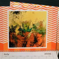
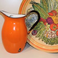
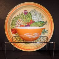
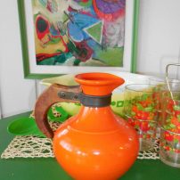
This current color study was a little bit different in that I wanted to explore the off-shout colors that gobble up attention — rust orange that dominated the late 1970s and is making a comeback today, and vivid orange-red that was a popular kitchen accent from the ’40s to the ’60s.
A few years back, primary orange was pop-trendy. Today, red-orange is a popular kitchen accent color, along with bright lime-green and turquoise.
Even though color-wheel orange is pretty obvious, there is a natural tendency to explore and adopt the boundaries of anticipation or desire. “We love orange — but not that orange.”
Over and over folks did not hesitate to say, “I love orange.” For me to say anything derogatory about orange — oh my, one would think I stepped on the family’s puppy.
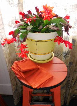
 Orange may be a maze of directions and overwhelming to the senses if overdone, but there is one avenue that can’t get enough of the hue. “The more the merrier,” many would say. That is the garden! Like a bull elk bugling to summon elk cows, more is never enough. Same with a garden.
Ron Gillespie’s massive and creative summer gardens explode with orange. Exploring the garden is a maze of different colors and textures. He intentionally places orange throughout.
“It is a unifier and gives punch to the entire scene,” he said. I asked him if there was a garden limit to the powerful color. He did not think so.
The color orange may not be as arrogantly powerful as the color blue, but it can be overwhelming at the drop of a hat. For months, I almost encased myself with the pumpkin hue. I wanted to run away and escape. A total interior maze of orange was so nauseating. Relief came with partners. Orange, like pink, needs dancing partners.
Yes, I do love that color, but more to the bright-red side and more of an accent, whether applied to interior design or art.
Agreed, orange is a beauty. But also, orange is a monster.








Comments