 It rolls off the tongue like grapes on sand paper. The word is not only awkward to say, but orange is a poet’s dilemma. It may be a color always there but less thought of, perhaps like a stagehand whose presence is necessary but not always marquee-worthy.
Orange is associated with the fall season and easily plays sidekick to commercial endeavors and structures, as seen on the recently painted Space Needle, but I wonder why it is called “gold” and not the apparent color, orange.
Its popularity has dramatic ebbs and lows, as I would soon discover.
I have done a dozen color-study articles for WestSound Magazine. Blue proved to be the powerhouse, red was the emotionally dramatic diva, basic green when overused could be nauseating, perky purple was like a morning tap-dance and yellow proved to be that happy-face hue where a little bit goes a long way.
 As far as black, brown and white, they are wonderful — just ask Architectural Digest. Thumb through a few dozen of those magazines and that is all you see. Neutral colors will not distract from a structure’s line and form.
Thumb through other interior design magazines and more color is presented. This year, some professionals have proclaimed orange to be flavor-of-month. Not rust, burnt, muted or red orange, but true color-wheel orange. Now that ever-loyal stagehand we call “orange” wants to take a bow, but audiences are leery, attendance is low.
 I interviewed more than one hundred people about use of orange in their homes. More than 95 percent said no, none or never — lest for maybe a hand towel, kitchen doodad or the hue mixed within an art piece. Men seemed reluctant to even say the word orange. One interior designer from Minnesota who was visiting my art gallery said, “Orangen needs to stay back with the Brady Bunch’s kitchen counter top.”
The late ’60s loved orange, proof being in a 1968 book, “The Complete Encyclopedia of Homemaking Ideas” by Barbara Taylor Bradford. The interior midcentury imagery seems humorous but further study gained more acceptance. The use of extreme texture mixed with bright colors annoyed me, until I realized that today we are seeing a repeat performance on many fronts, especially in the kitchen.
Today, there are a lot of orange kitchen accessories and gadgets, and occasionally the hue carries to the walls. One woman called her choice “Tucson-inspired.” Another said she used it everywhere, as if part of a basket of vegetables.
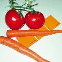
 To begin a color study, I buy a can of that color paint and spend hours going through design magazines. Orange was interesting in that it seemed to be most used when diluted, enhanced or partnered. Any true orange seen in a room setting was a deliberate orange “feature.” Diluting, darkening or partnering makes the hue a “standard.”
Orange that appears deeply saturated toward the browns, or diluted to grayed salmon tones, is often used. Why? It is neutralized and it was pointed out to me that the neutrals are economically practical.
Knowing that I was tackling orange, one of my color consultants exuberantly ran up to me one day to let me know that all his clients were using orange.
“Show me a color sample,” I said. Looking at the swatch, I saw it was a rusty deviation. This is what I found most often, or a milky direction or a red-orange.
It’s easy to find the ever-popular and timely burnt orange or red-orange, but usually not the true color-wheel orange, the last one in my color study series.
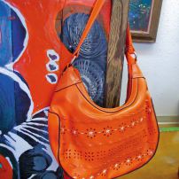
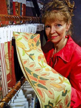 With a pumpkin patch/cream cycle mentality, I jumped in the orange arena a year ago — bought a can of paint, an orange purse, an orange pair of wedged heel shoes. I skimmed through design magazines, began interviewing people, visited furniture galleries and started picking up orange color dishware. I even tried to associate it with music but both my jazz and country western musician friends were stumped. “Orange Blossom Special,” one shrugged and there was the mention of a jazz standard about an orange sunset.
I didn’t expect to find much orange furniture, except for patio pieces.
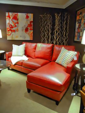
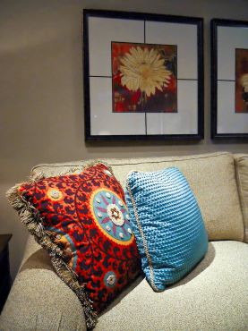
Visiting Arnold’s Home Furnishings in Bremerton, I did find accessories like pillows, lamps and art pieces. Kathy Christensen, merchandise manager, said that now their customers are using orange accents but that may change. “Color living trends usually follow the fashion clothing trends,” she said.
My first gallery interview was with a stranger, a young professional-looking man who happened to be visiting the gallery.
 “I am asking people how they feel about the color orange,” I said.
He paused for a good minute, then answered, “It is emotionally and historically a deep color.”
From that moment, my study direction flipped upside down, as garden patch silliness turned serious. He brought up the color of jumpsuits that prisoners wear and “Agent Orange,” which has devastating consequences to this day.
Most of the men I interviewed did not like orange or maybe did not want to admit it. They brought up such associations as hunting vests, road crew vests, “Clockwork Orange,” Halloween, sports team colors and school colors.
The color became an unexpected journey. I had put it off for almost five years. Orange? Little did I realize there would be such diversity, challenge and excitement.
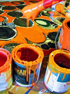
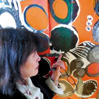
 What to do with that orange paint? A large, unframed black painting with circle shapes got my attention. It had been part of my black study years back. If I applied orange to the surface of black and gray circles, would it look like Halloween? I did and it didn’t. A visiting floral designer said it was because I had white within the composition. She also said that I should look into the flower world to really understand the power of this extraordinary color, making reference to parrot tulips and birds of paradise.
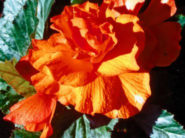
The floral aspect took me in yet another direction. I visited retired music teacher Ron Gillespie’s massive and creative summer garden that explodes with orange. He said that his intentional use and placement of orange seems to unify and give punch to the entire scene.
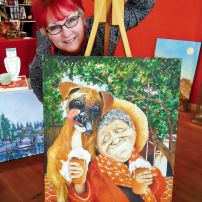
Then artist Shell Wilkerson showed me one of her orange-themed paintings and pointed out that her hair was orange. The backstage color that I once paid no mind to, now seemed to be everywhere.
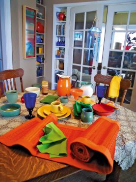
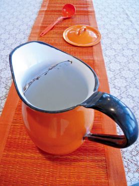
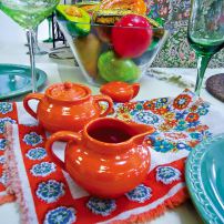
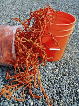 I also began arranging orange things on table surfaces — in my home, gallery and studio. I spent weeks collecting, arranging, painting and talking about the color. Soon conclusions were drawing.
Orange’s survival in an interior living situation depends on companionship. It is a herd creature. Its healthy power depends on the edification from others.
One morning I realized its heaviness was steadfast and annoying, not dance-quality red or a power soloist like blue. An extreme sea of orange items seemed to pout like a miserable child whose goal is merely to play with others.
I began haphazardly adding other colors, minimizing orange on the table arrangement. An emotional glee sprouted. I felt better (happier), as if a weight had been lifted.
I and orange are coming to an understanding. The heavy hue may evoke a variety of connotations but orange at its best loves to be around other colors. A good pot of soup needs more than just carrots.
That stagehand orange? Come on out and take a bow but bring the cast with you. And complete the performance.











Comments