


 If you’re the kind of person who needs to have balance and harmony in your home, then choosing the correct color scheme when repainting is probably a significant source of anxiety. Breathtaking design principles are easy to enjoy but difficult to execute. You want to have a house that impresses and comforts friends and family alike, but you don’t know where to begin.
This article breaks down the principles of color theory and provides practical tips on how best to take advantage of color, lighting and space to achieve the envy of the block.
First, we have to get a bit scientific.
What Is Color Theory and How Can I Use It When Painting My Home?
Color theory is a collection of design principles comprised of equal parts optical science, philosophy, anthropology and psychology. Its earliest iteration goes all the way back to Sir Isaac Newton, who is more famous for revolutionizing the study of physics with his theory of gravity.
Ever the polymath, Newton was also interested in the nascent scientific field of optics. He invented the color wheel and categorized colors into three categories, which we still use today.
 What is The Color Wheel?
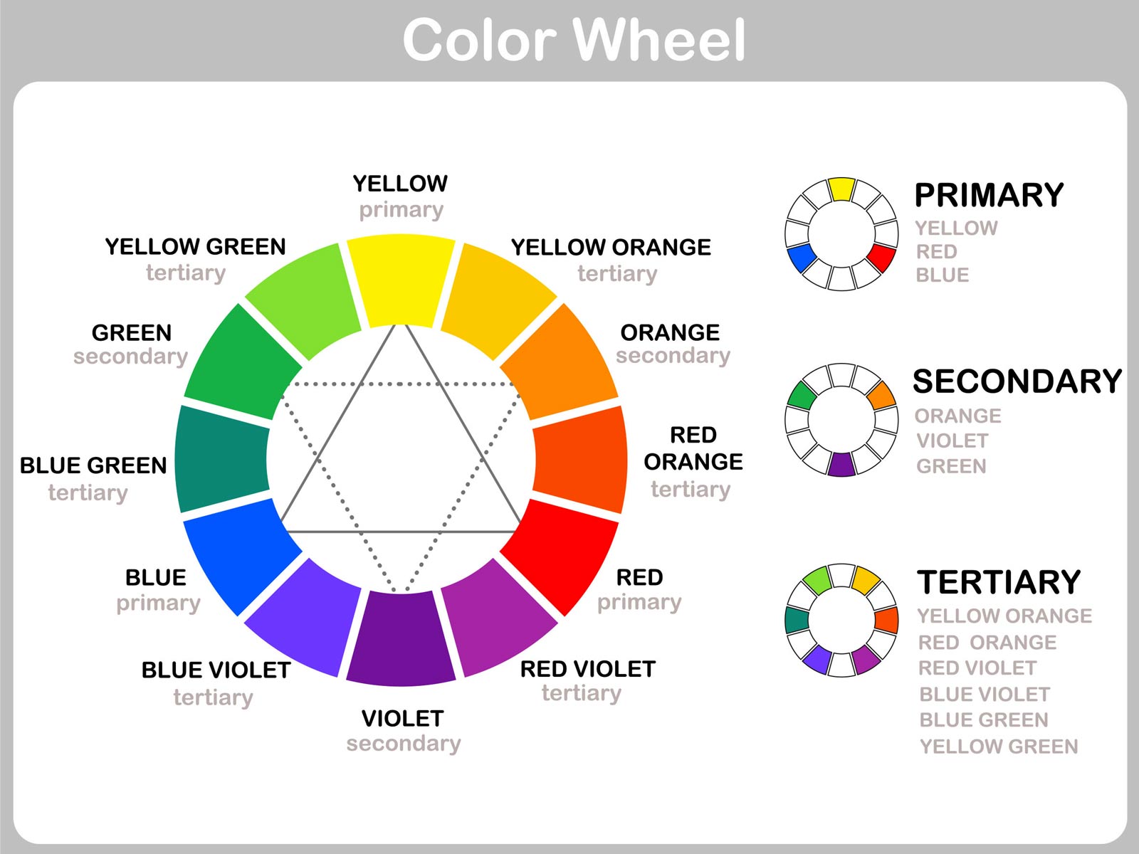
- Primary colors — red, blue and yellow
- Secondary colors — made by mixing primary colors: green, orange, purple
- Tertiary colors — made by mixing primary and secondary colors: everything else!
Several developments added different parameters to Newton’s color wheel. Based on these developments, every color also has two additional properties in addition to its hue:
- Hue — this is another word for color. Refers to how a color appears; red, blue, yellow, etc.
- Chroma — this refers to the purity of the color. It can have added shades, tints or tones. Shades are made by mixing the color with black. Tints are made by mixing the color with white. Tones are made by mixing the color with gray.
- Lighting — this refers to how lit the color appears. If too brightly lit, the color will appear washed out and white. If not lit at all, it isn’t visible.
These three properties of color affect how humans perceive the world around them. Understanding how designers think about color will help you make better decisions when choosing a color palette for your home. But, how do designers actually use the color wheel?
How Designers Use the Color Wheel
There are several ways designers use the color wheel to develop different color schemes. Here are the main types of color schemes that utilize the color wheel:
Monochromatic Color Schemes
These color schemes involve selecting one hue — remember that’s just one color — and adding white, black and gray to develop different tints, shades and tones of that one color. Then, the designer tastefully chooses what tints, shades and tones to use on different features.
Analogous Color Schemes
Analogous color schemes involve choosing three adjacent colors from the color wheel — like blue, blue-green and green. This scheme uses a small portion of the color spectrum and can feel very “one-sided.” Often, designers will pair an analogous color scheme with white, which can help blunt the heaviness of having a whole side of the color wheel present in your design.
Complementary Color Schemes
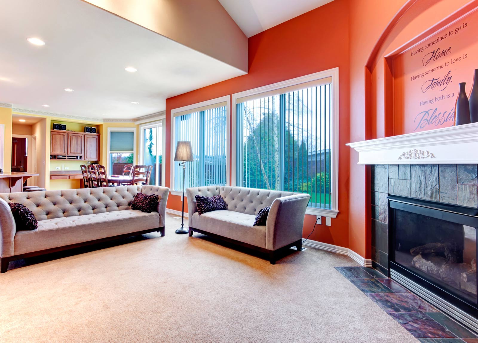
Complementary color schemes involve selecting two colors on the exact opposite sides of the color wheel. These color schemes are intentionally bold and effective at making loud statements. Red and green or purple and yellow are two examples of complementary color schemes. Complementary colors have high contrast.
Split-Complementary
Split-complementary color schemes are used to blunt some of the boldness of regular complementary color schemes. Designers will add the adjacent colors of both complementary colors originally selected to reduce contrast and soften the visual intensity.
Triadic
This color scheme involves choosing three equidistant colors on the color wheel. Because the color wheel is a circle and circles are made up of 360 degrees, triadic color schemes are made of three colors that are 120 degrees apart. Triadic color schemes still have a high degree of contrast — think red, blue and yellow — but they have an extra color compared to complementary color schemes and offer greater customization.
Tetradic
This color scheme uses four colors — two sets of complementary colors. An example of a tetradic color scheme is blue and orange (one complementary color set) plus yellow and purple (another one). Designers often choose one dominant color and use the remaining three to accent and contrast with the main color. This color scheme can be difficult to use effectively, but it allows for more extensive and creative use of color.
Square
This color scheme is similar to the triadic one, but instead of three colors spaced 120 degrees apart, designers choose four colors spaced that are spaced evenly 90 degrees apart. This scheme is most effective when all four colors are used evenly.
How Do I Choose the Right Color Scheme for My Home?
So, that was a bunch of information! It can be overwhelming to learn so much in such a short article. Don’t worry. Now we can dive into how you can choose the color scheme best for your home.
Here are some questions that will help guide you toward the best decision. These questions aren’t designed to give you an answer, but rather to get your creative juices flowing. Perhaps by considering these questions, you’ll have fresh insight.
What Color Is Your Furniture?
It’s common sense that a room’s wall colors don’t exist in a vacuum. You’ll need to consider the color of the stuff you are planning to fill the room with when you are all done painting.
If you’re getting new furniture, you can tailor the color of the furniture to your new paint scheme. But if you’re planning to use your old furniture, you’re a bit more limited in your color palette.
If your furniture is dark, do you want to create contrast by using light colors? What about if it’s light?
How Much Natural Light Does the Inside of Your House Receive?
As mentioned above, one of the additional properties that affect how we perceive color is the lighting it receives. If the room doesn’t receive much natural light, colors will appear darker and more saturated. Even colors that don’t appear dark out of context can be quite intense in a room that receives little-to-no natural sunlight.
What Are You Trying to Say Through Your Color Scheme?
Color psychology is an interesting interdisciplinary field that looks at the cultural and psychological significance of color in human societies. By understanding a bit about color psychology, you can imbue your room with specific, intentional energies.
This might sound far-fetched, but color has real and measurable psychological and physiological effects on humans (as well as other animals). As a brief example, let’s explore some of the established effects that two different groups of color have on humans.
Warm Colors
The color red can increase a person’s blood pressure and heart rate. It’s associated with passion, romance and anger. Yellow is associated with high energy and compassion. Orange is associated with joy and optimism.
Cool Colors
Contrary to red, blue has been shown to lower blood pressure and help people feel calm. Perhaps, due to its ubiquity in nature, blue is a color that helps humans relax. Greens can also have this effect.
What colors would you use for a study with these thoughts in mind? How about your kitchen or bedroom? When you consider color psychology, you can increase the effectiveness of a room’s desired purpose.
What Color Scheme Is Right for You?
Did you ever know that color could be so complicated? Hopefully, after reading this article, you have a better understanding of color and how you can apply it to not only dazzle guests but also reenergize in the morning or cool off after work.
Color is more than just what we see —it’s how we see. Color informs how we want to live our lives. What color scheme is right for you?


Comments