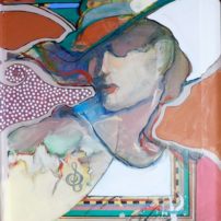
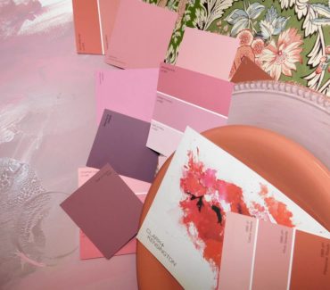
 Such an awful color that words can hardly explain, a muddy pink or a neutral, pale purple with a gray tint. I have little idea why this outdated color was selected, only that someone referred to it as an up-and-coming trend. “Really?” I thought to myself. “Are we going back to the pastel shoulder-pad days of the early ’80s?”
People don’t even say the word “mauve”; rather, we hear fancy, frilly terms. I went to the paint department at McClendon’s Hardware, and of all the paint color samples, could not find one that just said mauve. One color was called “mauving up.” Benjamin Moore did have several color names listed online that included the word.
 Next stop, Belfair, The HUB thrift shop, or what used to be called Faith in Action. I figured there would be some consensus as to this color’s use today. But no. It was laughable — there was little mauve in the entire store.
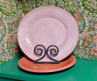
I bought two different pale-pink plates that were what I would consider close to mauve. I just wanted to get a feel for this color that is neither cool nor warm but can be both. Frustrating not to have words; I guess it’s like walking into a dark room with a low-grade flashlight. If one lets light in and softens things up a bit, maybe mauve becomes more pleasant.
There was only one thing I could do. Other past color articles I wrote examined every nook and cranny and interview architects, landscapers, interior designers, advertisers, florists, furniture stores and the general public. I did tackle a public survey on the color and results were surprising. Most folks I talked to liked or even loved the mud-pink hue, but the same sentence concluded with, “But I don’t like pink.”
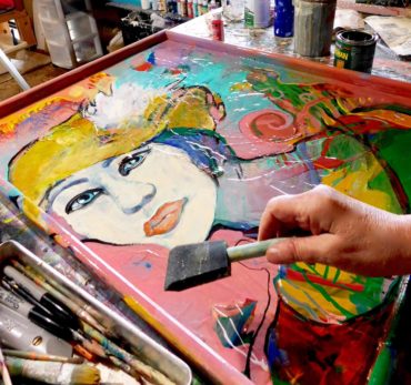 Mauve, oh mauve — where do I go? What do I do with you? I only saw one solution for understanding: paint.
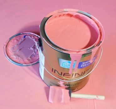
First, I bought a gallon of pink paint and began creating different degrees of mauve, adding blue with splashes of black and yellow. Interesting — my curiosity sure was peaked.
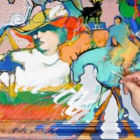
It didn’t take long to realize mauve would be a difficult color to examine. I needed to jump right in and decided to take my study right to the canvas.
Since I’ve been painting most of my life, I have dozens and dozens of completed paintings tucked away in my large, private art studios. Having turned 75 and recently retired from my retail art gallery, I have this huge yearning to learn, and now have time to do so.
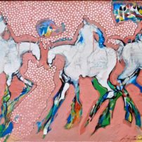
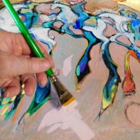
I chose a big, horizontal piece with five horses and riders. Since I grew up with horses, it’s a frequent imagery subject. I took this painting and sanded it enough to then accept more paint. And that is what I did — applied a field of mauve.
That surprising, light-mud-rose concoction looked wonderful, or maybe it was the novelty that was captivating. The painting turned out great, even though later I would gasp at so much pink.
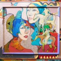
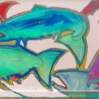
Then I selected another studio-stored painting, and then another, and then another until in a four-month span I recreated 10 large paintings, all with some degree of mauve, from being on the purple side to tilting to the warm side.
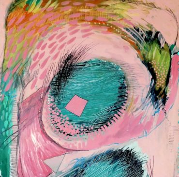 I had become enthralled, captivated with what mauve could do and how it felt adding white dots and weighing the academic elements of design. These weren’t just splatters of paint. I painted probably half of the surface of each painting with mauve and then worked from there.
One 37-by-29-inch painting, titled “Remembering My Horse,” was very ornate with female and horse imagery. Nice, why change, why ruin a good thing, I thought, but this is what you have to do to learn. I took my luscious, pale mauve color and painted almost three-quarters of the surface, painting out much of the imagery. A bold move, but I did it, and then I finished the painting accordingly.
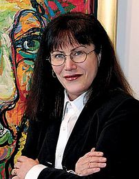
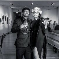
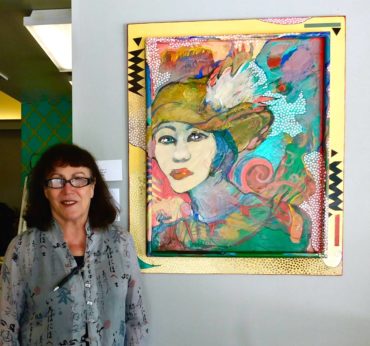
 Another painting, “Winter’s Lost Bride,” was one of the first in the mauve study. It had been a study in material application, lots of color and tactile texture. I painted a woman’s face at the far lower left, with mud pink fields dancing with colorful abstract shapes. It sold with first showing, but luckily, I got a photo of me standing with it, so I can share. There is only a little bit of mauve in it, but it was a first — the start.
We may not talk about mauve, but that doesn’t mean it is not used or will not be the future craze.
The color has been around a long time. The word comes from the Latin “malva,” meaning a flowering plant, and became a color name in the late 1700s. In 1856 a young scientist discovered and marketed a dye called Mauveine or Perkin’s Mauve. It would be very famous in the industry, and the 1890s were known as the “The Mauve Decade.”
An awful color indeed, but hence forth, it is my personal awful color, definitely my learning partner. Before I retired, the art gallery and bookkeeping took all my time, and painting too often came in second. Now there is time and a lot to learn. Another color study? I’d say no, have done like 14 color articles already. But, I think moss green is knocking.


