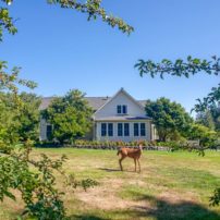
 After months of deliberation and dozens of drive-by trips, a young couple decided to follow their hearts. They stopped the car and fastened a note to the mailbox of the old farmhouse.
“We’re looking for a place to raise a family,” the note said. “Would you be interested in selling?”
The owners, a retired couple with dreams of Hawaii, loved their home on Bainbridge Island. But this, they decided, was a sign. It was time to move on to the next adventure, especially since they’d be leaving the circa 1906 house in the hands of a family who had a strong attraction to the place and longed to write the next chapter in its 100-year story. So they said aloha, and the young couple moved in.
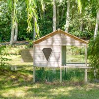
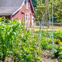
 For the next nine years, they rolled up their sleeves and made the dated but decidedly charming old house their home. They grew vegetables. They picked apples and pears in their orchard. They added a chicken coop and a flock of hens to one of their pastures. And they had their family, first a daughter and then a son.
It was perfect, just what they’d imagined. Except for one thing — the house was by no means perfect.
Yet they believed it could be.
 Keeping It in Context
“We took a long time to think about what changes we’d like,” the wife says. “Mostly we wanted it to be modern-day functional with respect for the history of the house.”
Their first step was to contact Smallwood Design and Construction, a Bainbridge Island company whose owner, Rob Smallwood, had given the couple a bid for a modest remodel years earlier. This time their go-to was his son, Ryan Smallwood, who served as project manager during what turned out to be a yearlong overhaul.
 Realizing the extent of the renovation the homeowners had in mind, Ryan Smallwood was upfront with the price.
“We knew it was going to be costly, but that wasn’t the point,” the wife says.
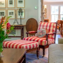
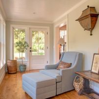
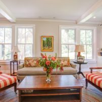
The point — for the homeowners as well as for their designer, Michelle Burgess — was to honor the home’s heritage and architectural personality. Twelve months and a million decisions later, the result is an expanded and improved update of the original that brings to mind canning, quilts and cherry pie. It’s traditional but as fresh as laundry on the line.
 Remodeling a 100-year-old house is never a straight line (in part because an old house’s lines are never straight), and this one was no exception. Just ask the builder, the designer and the owners.
“We came up with a lot of ideas on the fly,” Burgess says. “There are a lot of unknowns in a house of this age. You have to be open to improvisation.”
Down to the Studs
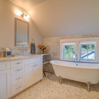
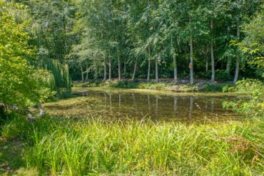
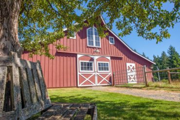
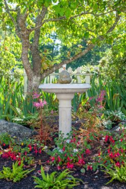
The homeowners came in with four big wants. First, to add square footage by pushing out the west wall and expanding the upper floor and the basement. Second, an obvious entry. The original layout with a door on three sides of the house left visitors wondering which door to use and the family wondering which door to go to at the sound of a knock. Third, a second upstairs bathroom. Finally, they wanted the property’s lovely, sunlit pond and orchard to become a focal point.
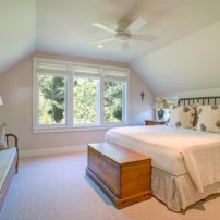
 The project evolved week to week. Eventually, the house would be taken down to its studs. The new roof over the addition turned into a whole-house reroofing. Windows and doors were all replaced. Porches were added and entryways covered. Smallwood gave the house an earthquake-resistant structural upgrade. The addition extended the upstairs master and added a new family room on the main level.
As the builders dug in, Smallwood enjoyed the home’s many reminders of what construction was like in days gone by.
 “The floor joists were actual old logs,” he says. “Along the way, someone said, ‘I’m going to put a window here’ and cut a hole in the wall. There was no insulation. Also, there’s nothing square in an old house like this; the trim was a challenge.”
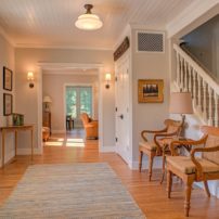
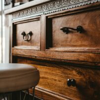
Smallwood and his crew did some reframing and gave the house all-new siding. They also installed its first insulation. Wherever possible, they saved and reused original features including railings, beadboard and oak flooring.
“You gain a lot of character by using what’s here,” Smallwood says.
 A Place for Family
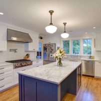
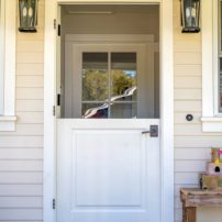
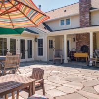
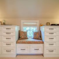
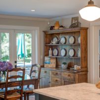
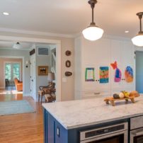
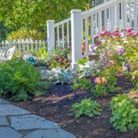
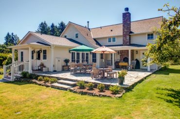
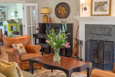
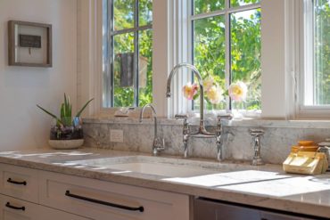
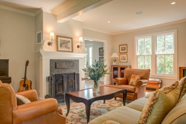
The team also added lots of attributes, such as a Dutch door to a new flagstone patio and an all-new kitchen starring countertops of dramatically veined Calacatta marble (Michelangelo’s favorite). Windows have turn-of-the-19th-century appeal and are paired in most cases, just like the originals. Window seats on the main and upper floors are a nod to nostalgia. A hidden TV cabinet above the family-room fireplace is the homeowners’ reluctant concession to modern distractions.
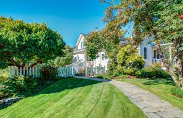
Burgess finessed every detail down to the colors. Clean, gleaming white is featured prominently on cabinetry, trim and cladded beams. The owners and Burgess gave a lot of thought to the exterior color. They considered blue and yellow, but eventually white won out. It is a classic farmhouse color, but they didn’t let the provenance of the house dictate every detail.
 “We didn’t have to be slavish in our remodel,” Burgess explains. “We live differently now than back then. We want the house to be young and fresh, not old-fashioned.”
In the end, the team created a refreshed farmhouse that’s homespun, like a Chanel suit. The vintage home remains intact, melded with a seamless addition. The homeowners see themselves as stewards of a piece of island history.
A plaque outside the door proudly states: Built in 1906. Most importantly to them, the farmhouse remains what it always was, a place for family. It’s just what the couple always wanted.
“It’s somewhere the kids can run around and catch tadpoles and salamanders in the pond,” the wife says with a smile. “The TV cabinet will stay closed.”


