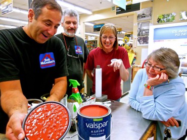
 Like shopping and seeing a great pair of shoes that knocks your socks off, but in my case it was a gallon of mismatched paint on a back-corner sale shelf.
It was an odd color — not vermilion, not burgundy, not orange and not primary red. It was fascinating in that it appeared to be a commonplace hue without definition.
I plunked the gallon of paint on the paint counter at Scott McLendon’s Hardware in Belfair. We all examined it, thinking it was bright but wondering what yellow would do. Then a passer-by took notice and suggested adding white.
At the same time, a customer’s gallon of paint was being mixed — the most gorgeous vivid blue I had ever seen. It was like a color party in there as she laughingly mentioned blue. We explored four-color additions.
 I left as proud as punch, carrying a gallon of red paint that would be my next study. There had been a previous red color study, but nothing like “this-red” hue.
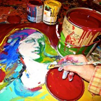
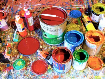
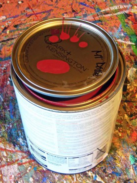 Arriving home to my art studio, I gathered up old cans of paint and situated my workspace, getting ready for a major challenge. At first it was a few stokes of paint, just to emotionally feel the paint and the color. Then I opened a can of cadmium red and applied more paint strokes so as to get a comparison.
This-red was very reluctant and heavy, and seemed to appear brown when partnered next to yellows and medium cadmium reds. It was only when I introduced ultramarine blue with a hint of white that I got a clap-start, finally a color that popped out that-red.
 Going to another blank matboard on the easel, I began heavy paint applications, creating recognizable imagery of a woman’s face. Heavy gobs and streams of paint ran down the surface. It was so obstructive that I took it to a flat surface. Then I used my hands to distribute the thick paint.
 That-red and I soon came to know one another, as I was discovering the odd hue to be more like a big, fluffy, house pet rather than something dark and foreboding. Still, it was mysterious, as I would soon find out.
I painted an entire sheet of matboard just that-red. This would act as a mobile color sheet.
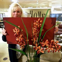
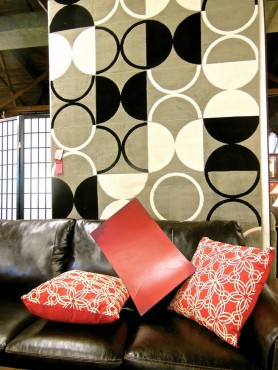
I hit the road with that 16-by-20-inch red swatch. First stop: Arnold’s Home Furnishings in Bremerton. The designers there are up on color definitions and have helped me in the past.
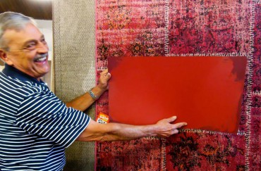
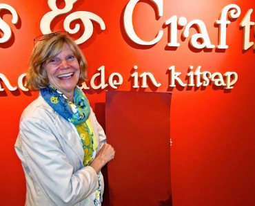 Initially rust was mentioned, but as we took the swatch around to make comparisons, designer Cate Adams referred to that-red as a chameleon. It seemed to change and look different with each color partner. Even though that-color was not quite the same as the colors of the furniture pieces, it did not clash. That-red was very cooperative.
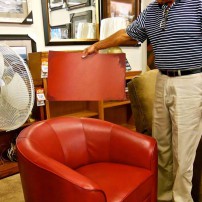
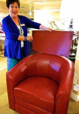
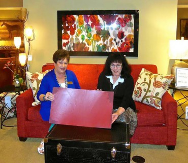 Later that same day, I made a visit to Great American Furniture, also in Bremerton. Owners Carl and Sally Glivar have helped me in the past with beds and mattresses and other color studies. I found less red and more neutrals there. Carl was also not sure what to call this red color that I presented, but he took the big swatch over to a red leather chair. It was a pretty good match.
 I wasn’t necessarily looking to match my color, but rather explore that-red and the intimacy of reaction and application.
I met with artist and Bremerton High School teacher Janice Wagner, who found my color swatch adventurous. It reminded her of the color of East Asian furniture and she thought it would go well with the gold and forest greens, like those of a caribou’s harness. She also thought it to be a good accent color to go with neutrals.
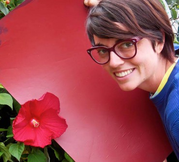 The study thus far showed that-color to be friendly but heavy — rather than a tap dance, it was a waltz.
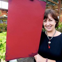
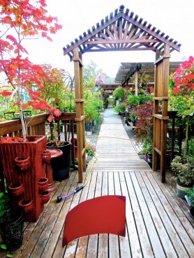
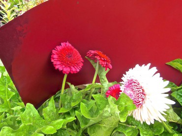
But the waltz took a visual snap at my next stop, Bremerton City Nursery. I felt like a little kid, darting from here to there with this large piece of red illustration board, seeing where it looked best among buds, limbs and blossoms. Nursery manager Alex Siefert could hardly keep up with me.
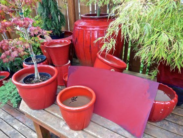 The swatch had become a companion mascot of sorts. It drew a lot of attention when I wedged it to stand upright on the long garden pathway, as if it were just a strolling character.
This mismatch color definitely plays well with others. It would not be my favorite color today, for I would prefer my reds to be warmer, whereas this hue has a touch of coolness (blue) to it. I prefer a warn rust to a cool burgundy, but time often changes color favorites.
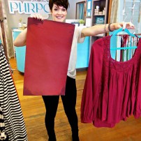
Wearing that-red took me to Purpose Boutique in Bremerton, a trendy shop that donates a percentage of its profits to women’s causes around the world.
 I did not find clothes in that exact color. In fact, few items were that color, but interestingly that-red came close to blouses that were center-features by the front door.
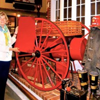
Since the Kitsap County History Museum was just down the block and I was having so much fun with my color swatch, I decided to visit director Patricia Drolet and inquire about red artifacts and antiques. We didn’t find many, but the big, red fire truck wheel was outstanding. But it clashed a little with the traveling color swatch.
Lastly cookware, that sense of taste and smell feeling: Besides an art gallery, I have a Pyrex Museum in the heart of downtown Bremerton. I would have sworn the swatch would match the ’70s “Autumn Harvest,” a burnt orange well versed to dominate that vintage era. But alas, that-red, the oddball color, sort of in the ballpark but not a midcentury companion.
 Two steps left — paint furniture, and I continue painting with that-color in my studio. Already that-color and I are pretty friendly. A nice color that could turn dark at the drop of a hat or dance with a bright blue and become sun-like, that-red makes a good wall color or leather lounger.
For my art palette, that-red makes me struggle. It would be an afterthought as I mix other colors. It appears to be bright, as when I carried the gallon of paint from the hardware store, but when I got it home and introduced it to my other colors, it turned brownish and heavy.
I always tell friends who are in a decorating mode: Get professional advice with color, for colors can be sneaky little creatures.
And speaking of sneaky creatures, time to buy a great pair of new shoes.


