 Color is fun. Color is confusing. Color is important. Color is overwhelming.
Depending upon how you responded to the above statements, you may want to seek some help. If so, you may want to talk to Connie LaMont.
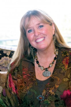
LaMont is one half of LaMont Design, Inc. in Poulsbo; the other half is her husband, architect Wayne LaMont. The couple combined their businesses in 2001, but they’ve been partners in life for 29 years. The past 15 of those years have been spent in Poulsbo after moving north from California, where they grew up and met when Connie was just 16 years old.
In person, Connie LaMont is warm and chatty, with unfussy, long blonde hair and blue eyes. She has both a bachelor of arts from the University of California Irvine and another four-year degree from the Interior Designers Institute in Corona del Mar, Calif. She claims once she was really shy and suffered from a lack confidence. It’s a picture that’s hard to square with her present-day effervescence and success as a very in-demand interior designer and colorist.
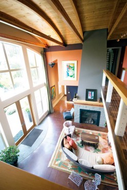
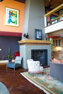 For more than 20 years, LaMont has helped people sculpt the places they live. She believes in the power of color to transform spaces, create atmosphere and even resolve conflict. If that sounds like a pretty tall order for something as seemingly basic as color, talking to LaMont will make a believer out of anyone.
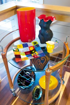 Take a person’s resting heart rate, for instance. According to LaMont, the resting heart rate can determine how someone responds to strong colors like red. Red is a powerful color and generally works for “very strong individuals who get a lot done typically,” she says. But if that person has a lower resting heart rate, red can exhaust rather than energize.
People with more subdued emotions tend to fare better with a lighter palette. LaMont recounts one instance when she consulted with a client suffering from chronic fatigue syndrome. When LaMont visited with the client, she was lying in a bedroom adorned with heavy red drapes. LaMont convinced her to move to another room in the house decorated with soft pastel greens.
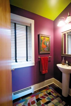 “After about 10 minutes, the woman felt better,” LaMont says. While green makes you feel on top of the world and like you can accomplish anything (LaMont once used sage green for an attorney’s office), it’s also true that the blue-green family “immediately calms you,” she says.
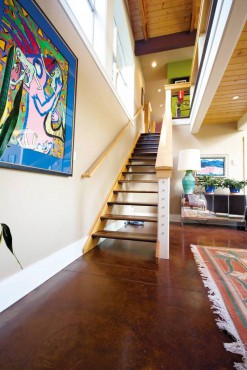 Sometimes LaMont consults with clients about their kids’ rooms. She asks questions about the kids’ habits, their performance in school, their friends and how they maintain their spaces. “If they’re a pretty organized person, you don’t want to create someone who’s going to, you know, straighten the fringe on the area rug,” she says with a laugh. “So we don’t want to put too much red into their room.”
The same goes for pink in little girls’ rooms. “A lot of little girls love pink,” LaMont says. “Well, if they are a child who’s prone to ADD (attention deficit disorder) and you paint their room pink, you’re going to have an ADD child, because their heart rate is going to be raised. It’s just forcing them to go really, really fast.” Sometimes, she adds, children who spend a lot of time playing in their rooms will be short of temper “because they’re exhausted.”
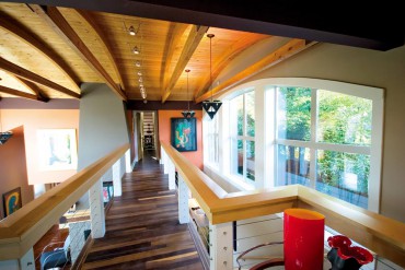 “If you need to have your heart rate higher or lower, it can be as simple as having a different color on your walls,” she says. “What your cones and rods are receiving is going to affect you, whether you believe it or not.”
Take white as another example of a color that often gets used to excess. A lot of people who suffer from SAD (seasonal affective disorder) will paint all their walls white, LaMont says. But while white is a wonderful accent color that plays well off other colors, “if you have white everywhere, you create a white shadow and it shadows only into a cold gray.”
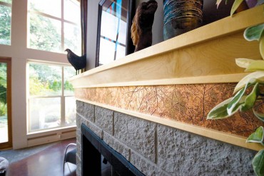 “That’s the only thing it can do. Cold grays are like living in a battleship,” she says. “They’re suffering from SAD, but what they haven’t done is bring in sunlight. So what I do is leave the white ceiling so it will work against the wall color, whatever it is, and bring in other colors.”
LaMont prefers to consult with clients from the very beginning of a home’s construction or remodel, because coordinating colors is about so much more than choosing paint colors. “Paint is pretty much the last,” she says. “You don’t want to get the cart before the horse.” If she’s involved from the beginning, she can help guide choices about everything in the interior — countertops, cabinetry, flooring, window treatments —?to make sure the colors work together.
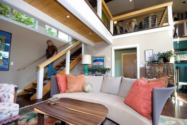 LaMont sometimes gets called into situations where conflict is evident, but she relishes these situations as opportunities. “All my friends tease me that I’m a color therapist,” she says. “I’m the color marriage therapist. It’s amazing how color is so very important to people. And it’s not just the wall color.
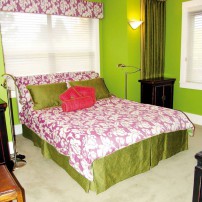
“So many times, people are like, ‘Well, I don’t want to give in. I want it my way,'” LaMont says. So she asks them to think about red and green, traditional Christmas colors that are “adamantly opposed” and “complete opposites on the color wheel.”
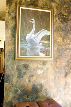 “They couldn’t be more opposite, and yet they’re complementary, and the reason is that when we put those two colors together, they make each other look better, number one, but they also vie for attention, so you can get a lot more energized from those two colors being next to each other than if you put colors together that are next to each other on the color wheel,” she says.
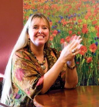 “We put those two colors together and they’re complementing, not compromising,” she says with a smile. “There’s no ‘it’s my way or the other.’ They’re both equal, they both make each other look better.”
In the end, it’s all about making a space come alive. “It’s really great when you start to sculpt a space with color, because if you had everything be the same tone, it would be flat-line,” she says. “You want the rhythm, you don’t want the flat line. You want movement, you want modulation. That’s what makes us get up and go. That’s the ‘wow’ factor.”


