 When Marc and Judy Williamson opened the door to the dated Bill Point rambler, they entered a house with a persistent identification crisis. Although the subtle Asian overtones of the architecture were good, the home’s previous owners had interpreted the interior with wall-to-wall carpet, crystal doorknobs and other Euro-centric details that denied the Eastern influence of its low ceilings and outdoor engawas. The home needed more than vision; it needed a fresh start.
 The Williamsons, newly arrived from California, were shopping for a home with lofty two-story ceilings, as in their last house. Nevertheless, it was love at first sight when Judy saw the clean lines and the Eagle Harbor views of the conflicted residence. In the rosy glow of romance, she was willing to overlook a few blemishes.
“We walked in and loved the feeling; it called to us,” she recalls. “It didn’t even matter that the outside was rotting.”
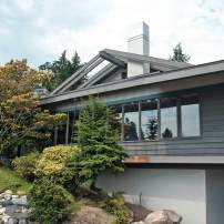
 At issue were the decorative engawas: narrow, veranda-like accents running beneath the windows. Over the years, these Japanese-inspired features had succumbed to constant soakings of rain falling through ornamental openings in the eaves above. When the couple purchased the home in December 2010, they immediately called in the experts.
A Job for the Pros
Enter the architectural firm of Miles Yanick & Company and interior designer Amy Duerr-Day. The goal was not just to repair the structure but to rework the interior and rev up the ambiance. The team, which included the hands-on homeowners, also wanted to bring the home up to modern energy standards.
 Yanick saw the potential. “The 1980s design was interesting but had outlived its usefulness,” he remembers. “It needed updating.”
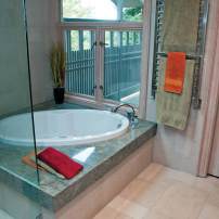
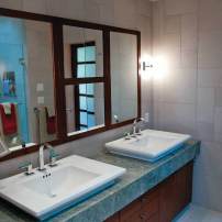
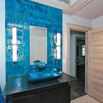
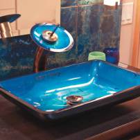
Yanick and his crew identified four primary areas of concern: the decrepit engawas, a two-room living room in which a fireplace hogged all the attention, an unfashionable kitchen and a master bath that practically required carbon dating. They would need to add appropriate venues for its new owners’ art collection. Finally, the overall result had to be pet-friendly to accommodate the family’s four Shiba Inu dogs.
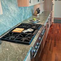
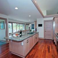
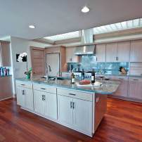
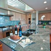
 As the project developed, it became apparent that every room would be drawn into the makeover, with improvements as simple as new flooring or as complicated as complete restructuring. The kitchen alone called for all new appliances, flooring, countertops and a custom, two-story hood flue as decorative as it would be functional.
Getting Started
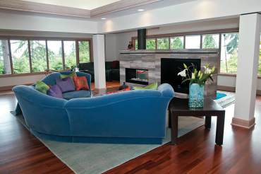
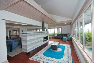
To head off any further structural damage, the engawas were replaced immediately, and the openings in the roofline were filled with glass panes to stop the soakings. Next, the team turned its attention to the living room, where two separate rooms would be combined into one. The wall slated for removal also harbored a problem fireplace — the elephant in the room.
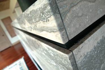 “It’s the classic modern American problem of having a fireplace as the focus of the living area,” Yanick says. “How do you reconcile a fireplace with a television? How do you fit two things into the same space?”
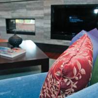
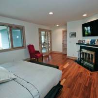
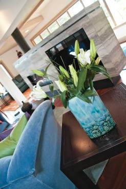
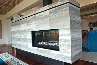
To complicate matters, the masonry of the chimney was crumbling and the unwanted wall was load-bearing. The latter conundrum was solved by wrapping the supporting beam and holding it aloft with dual columns. To reconcile a cheery blaze with 50 channels, the workmen constructed a fireplace island with the fireplace at one end and a 42-inch television at the other. Happily, this solution also served to screen the main seating area from the street.
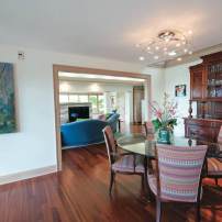
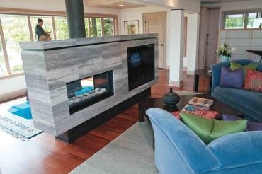 Wherever possible, the team saved and enhanced existing high-quality features. Duerr-Day was up to the challenge, composing a seamless blend of old and new. All of the home’s trim is original. The fir cabinetry was retained or repurposed and its hardware changed out to oil-rubbed bronze. Judy, who prefers her woodwork dark, nevertheless found the pale fir of the drop ceilings, trim and cabinets easy to live with. For contrast, Duerr-Day chose deep-hued Brazilian tatajuba wood flooring.
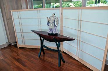
Surprisingly, the Williamsons discovered that many of their furnishings looked more at home in their new house than in the old. When rounding out the décor, the couple had particular success with both the dining room chandelier and an interior screen required to provide privacy from the entry walk. The screen figuratively fell into Judy’s lap when, during a visit to Seattle’s Bush Woodworks, she acquired a shogi screen that had been custom made for, then abandoned by, another customer.
The chandelier, however, presented a problem.
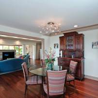
“The Williamsons aren’t fancy-chandelier kind of people,” observes Duerr-Day, who over the course of several months presented Judy with nearly a hundred pictures of lighting fixtures. Finally, perfection was achieved in the form of an LED fixture by Escale. Its simple swirl of pinpoint lights calls to mind a swarm of fireflies or a galaxy of stars.
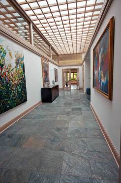
The team turned the home’s long, rather awkward entry hall into a blank canvas for the family’s collection of broad and bold paintings and textile art. The front door opens onto a horizontal side of this 10-by-35-foot lobby, rendering the unbroken opposite wall a private art gallery. The effect is enhanced by a ceiling of skylights and a floor of quartzite tile.
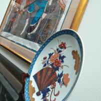
In the gallery’s pride of place hangs a museum quality, Plexiglas-encased kimono, collected by the Williamsons during a stay in Japan. Although part of the couple’s collection is from national or international sources, many of the pieces have island roots. In her role as a supporter of Bainbridge Arts and Crafts, Judy has come to appreciate — and acquire — the work of up-and-coming local artists such as Carl Sussman.
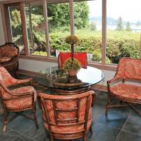
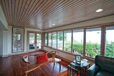 Throughout the proceedings, the team never lost sight of the home’s major attraction, the bird’s-eye views of Eagle Harbor, Puget Sound, the Seattle skyline and Cascade Mountains. The deck was modernized, lines of sight were expanded and trees were trimmed.
By the project’s end, however, the view was no longer the only attraction. Over the course of a year, the home’s mismatch was managed — beautifully. At last, fusion conquered confusion.


