Trendy has gotten a bad rap of late. My design clients and readers of my blog (www.SanctuaryAndStyle.com) often tell me that they can think for themselves. “I know what I like and I don’t need to follow trends,” they declare. Does that sound familiar?
Here’s my rule of thumb. If you are designing for your own home, always use the styles and colors that make you happy regardless of trends. But if you like something that happens to be popular right now, by all means use it and enjoy the great results.
Following are six examples of how some of my favorite designers have combined a timeless backdrop with fun and fresh (trendy) details.
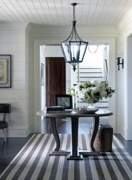
(1) Here is a large entry hall, painted white with a traditional lantern-style pendant hanging above a lovely curved leg table. What’s trendy here? The bold-striped area rug. Yes, stripes have been around since the beginning of time, but bold rugs like this one are particularly popular over the last five years. I love the way it adds energy and pizzaz to this classic room.
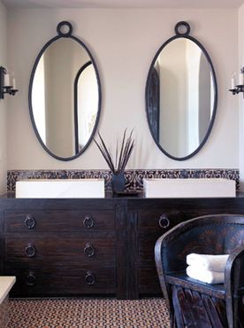
(2) A bathroom with white walls and a tile floor is timeless. A pair of matching mirrors hung symmetrically will never go out of style. This is a perfect canvas for a “touch of trendy,” like two vessel sinks placed upon a vintage chest repurposed into a vanity (also a trend).
Another fun trend we are seeing plenty of is the use of imported folk art, woven fabrics and carved, handmade furniture. The addition of something “global,” like a rustic Mexican chair, brings a zing of energy to this bathroom.
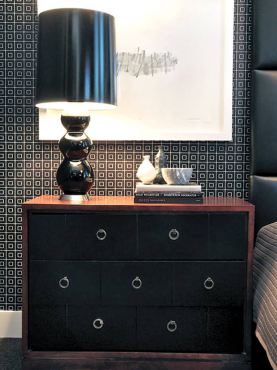
(3) Black and tan is a classically timeless color palette. It’s been used forever and is so serene and comfortable. However, it could easily be sleepy and boring. What if a polished black lamp with an on-trend drum-shaped shade were to be added? That would spice it up a bit. And how about a geometric black and white wallpaper? Wow! Look what happens. It’s still timeless but energetic and fun as well.
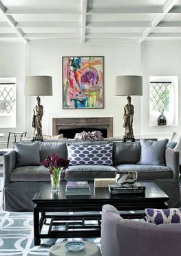
(4) People always want to know what is the hot color this year. Well, there are a few good color forecasters in the design community but many times I either don’t agree with their forecasts or I dislike their choices. That being said, the Sherwin Williams forecast for 2014 color of the year is subtle and soulful. It’s a plum with gray undertones and I love it.
Plum is featured on a classically styled contemporary sofa in an all-white room. The room is symmetrically arranged and accessorized with a pair of Chinese lamps and a Chinese coffee table. The plum upholstery is unexpected and fresh, and makes an impression on our memories.
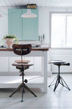
(5) Industrial styles and vintage pieces from old factories are enjoying a huge run of popularity. Now that they are a century old, we find them intriguing (the benefit of time passing). Here is a traditional white country kitchen with white walls, white painted floor and white painted car decking on the ceiling. It’s not an unusual or particularly memorable room until the amazing industrial stools are added.
What a great twist. It’s a bit of trendiness that adds so much personality to the mix.
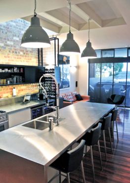
(6) Extra-large kitchen pendants are crazy popular of late. Almost every kitchen shown in design magazines these days features pendant lights above the island that are three times as big as “ordinary” ones. Here are three pendants over an island in a loft-style kitchen with an exposed brick wall. They certainly get your attention, don’t they! Notice there are no upper cabinets in this kitchen. That’s a European design trend that has come in over the past five years or so.
We can all have fun with trends. My advice is to use only the ones you love and don’t overdo. A little goes a long way.


