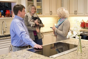
 It wasn’t just the bright-green Formica countertops that Tami Watts disliked about her kitchen. Watts and her husband, Brad, owner of Valley Nursery in Poulsbo, typically host holiday and birthday gatherings for their extended local family, now three generations. The long peninsula in the 25-year-old kitchen restricted traffic flow between the kitchen and adjacent living/dining room. Within the kitchen, it caused a bottleneck in which everyone seemed to lump together in one corner — and under chief cook Tami’s feet.
 A serendipitous encounter in the supermarket with Jim Collins, owner of Kitsap Kitchen & Bath in Poulsbo, launched them on their kitchen remodel project. Brad Watts and Collins played basketball together when the Watts family’s three grown daughters were small, but the men hadn’t seen each other in a very long time. This meeting rekindled their connection.
Collins has done custom building and remodeling for more than 30 years. They knew he was a good listener and was committed to efficient, quality work. As a full-service company, Kitsap Kitchen & Bath could provide design and project management, as well as build and customize all cabinetry. They didn’t look any further for a designer and contractor.
 “We set out to do a simple face lift — new countertops, painting or resurfacing cabinet doors — thinking we would do it on a real tight budget,” Tami Watts said.
But when Collins came over the first time, they started talking about “what if we did this, and what if we did that, and before you know it, it just snowballed,” Watts said. They began to envision an entire new floor plan, updated appliances and lots of efficient lighting.
Collins put his lead interior designer Tracy Corriveau and project manager Mark Thomas on the job. Corriveau is a certified green professional, certified aging-in-place specialist and lighting designer with more than 25 years of design experience. Thomas has worked with Collins as a remodeling specialist for 24 years.
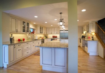 First they overhauled the floor plan to improve traffic flow by removing the peninsula. The biggest challenge the team faced was that the kitchen is built on a concrete slab. That locked in the location of the existing cooktop downdraft vent — right in the middle of the room, where the old cooktop sat on a small island.
“The whole plan was based around that vent,” Thomas said.
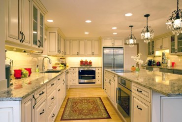
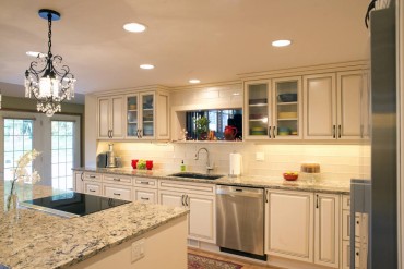
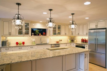
The new plan included a very long center island, 4 feet by 11 feet. The kitchen overall is 16 by 17 feet. The new island would house a large oven and a new cooktop, as well as provide lots of workspace, undercounter storage and seating room for bar stools along the outer long side.
 Removing the peninsula led to deciding whether to patch the existing hardwood floor or completely replace it. Thomas ran the numbers, and the couple chose the latter. The new floor matches and flows seamlessly into the living/dining room oak floor.
 The living room has an upscale, hunting-lodge look with earthy colors; a large, fieldstone fireplace; and a circle of Brad’s trophy ducks and geese mounted high on the walls, posed in midflight. The new kitchen color palette, which Watts described as “bold yet neutral,” flows naturally from the living room.
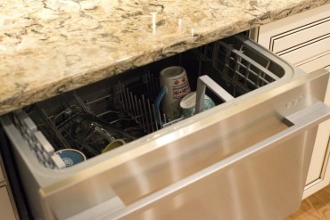
A high priority for Watts was to provide a space in the kitchen where visitors could hang out comfortably and help themselves to beverages, snacks, water and, she said, “stay out of the cook’s way.” A wet bar, really more of a mini-kitchen, on the other long wall does all that. All the mugs are stored there. It has a bar sink and a several small-size, pullout appliances under the counter — a dishwasher for cups and glasses, a refrigerator to hold tall beverage bottles, a tiny freezer below that for ice, and a microwave. A small trash bin hides in another drawer.
 Choosing cabinets turned out to be easy. Watts had a vision of a French country motif. At Kitsap Kitchen & Bath, she found exactly the custom cabinets she wanted. They were the starting point for the overall look.
 The doors and most of the drawer fronts have a raised panel, applied molding and special outside edge details that give them a traditional look. Watts went for the antique white option with a mocha glaze. Corriveau explained that the molding and edge details held the mocha glaze in the narrow borders when the glaze was wiped off the rest of the surface. The result is a tasty, creamy white with a dark-coffee accent. Very dark, almost black, cabinet hardware echoes the mocha.
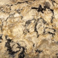
For countertops, the Wattses wanted quartz. Unlike granite, the quartz product (95 percent quartz, 5 percent polymer resin) is nonporous. It doesn’t absorb water, doesn’t stain or hold bacteria, and needs no sealing.
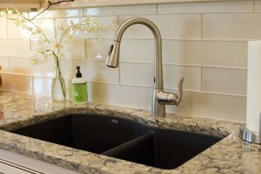 The color they chose, “Bradshaw” from Cambria Countertops, fit their “bold yet neutral” vision. It has a natural stone look. With an off-white ground matching the cabinets, it’s dappled with gray, light brown and black. Sparkly little copper flecks add a subtle bit of bling. Watts pointed out that the colors in “Bradshaw” tie together all the elements in the kitchen — the black sink, by Blanco; black, solid-surface cooktop; brushed stainless appliances and honey-color hardwood floors. Impressively, the 4-by-11-foot island countertop is one solid piece.
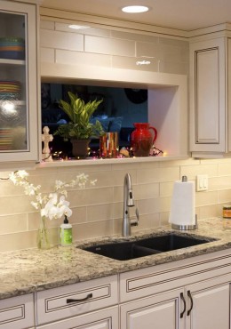
 From Bedrosians, Corriveau found glass tiles called “Cashmere” for the backsplash. They are clear glass with an off-white backing that has a foil-like, silvery-gold shimmer. The tiles are 4 by 16 inches, minimizing both busyness and grout.
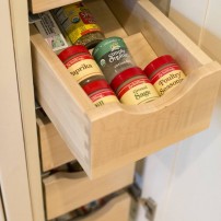
The Kitsap Kitchen & Bath team built a wealth of custom features into the cabinetry. Drawing from aging-in-place concepts, Corriveau incorporated many pullouts and drawers for efficiency and ease of access. Convenient now, these features will be a godsend in later years. For example, a heavy KitchenAid mixer, stored under a counter, sits on a device that lifts it out of the cabinet and raises it up to counter level.
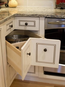
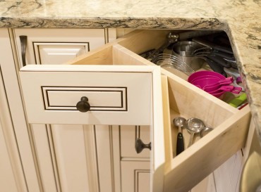
 Speaking of counter level, both Brad and Tami are tall people. To be more ergonomic, the new counters are 38 inches high instead of the standard 36 inches. In the corner, below the counter, Corriveau used a bank of corner drawers instead of the typical articulated, hinged door with a lazy susan. No contorted bending and reaching into corner dead space here. The faces of the drawers point inward to fit the corner. When open, they look a bit like a pie wedge cutout.
Pullout trays under the sink hold cleaning supplies. A deep drawer next to the sink holds garbage and recycling cans and opens hands-free with a servo-drive — just nudge it with a knee. Another fun, hands-free feature is the gooseneck faucet. A wave of a hand or arm past one of two motion sensors turns the water on or off. But it has an amusing quirk. One evening the couple heard the water turn on when nobody was in the kitchen. They suspect a fly flew over or landed on the motion sensor.
 Pull-outs also house small appliances, like those built into the wet bar, and a small, two-drawer oven under the counter near the refrigerator. Watts finds this pair of small ovens more convenient for everyday use than the big oven under the island counter.
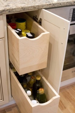
 Other thoughtful built-ins include a deep drawer next to the cooktop for tall bottles like cooking oils; a deep, large drawer with vertical dividers under the island for heavy baking pans; and a cabinet with vertical slats above the refrigerator for trays. The new refrigerator is flush with the counter edge, yet high on cubic feet.
Thomas points out that they built the cabinetry around the specs of the appliances.
“This project was unique because there are so many appliances,” he said.
 There are eight, in addition to the very high-tech, induction cooktop. The couple purchased all appliances at Schmidt’s on Bainbridge Island.
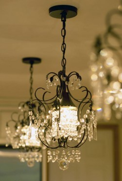
For lighting, Corriveau specified energy-efficient LED can lights. Small LED tape lights are discretely tucked under the front edge of the upper cabinets. All lights have dimmers, including the three small chandeliers hanging above the bar-stool side of the island. The chandeliers’ oiled-bronze hardware matches the dark cabinet pulls. Watts spotted them on Pinterest and they called out to her. She found them locally at Seattle Lighting. Richly hung with copious crystals, they add a feminine counterpoint.
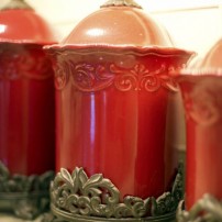
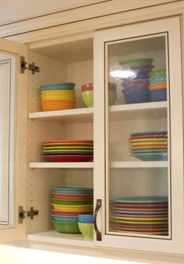
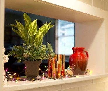
 The neutral palette makes a great backdrop for bright color accents: A couple of the cabinet doors have glass insets, showing off the red, orange, yellow, blue and green of their Fiesta Ware dishes. On the counters, a trio of large, Tuscan-red ceramic canisters and a chili-pepper-red dish holding a clutch of limes add spice.
The construction was completed in 10 weeks over a summer that saw lots of barbecue and takeout. When it was done, Watts said, they “got a dream kitchen” — efficient, comfortable and beautiful.
As for working with Kitsap Kitchen & Bath, they were “superhonorable,” she said, “and that’s something I’m going to remember.”


