 I recently read a great WestSound Home and Garden Magazine article by Molly Erin McCabe, “Much Ado About Countertops.”
The topic of countertops has fascinated me for some time — a level, utilitarian surface that ends unobstructed or with a wall. How does one design or decide what items to place on kitchen counter corners? Or is it even necessary?
Some might say that ultra-minimalist kitchen designs would not allow any item to set on the counter surface to clutter “flow.”
After examining many interior design magazines, it seems not always the case.
There is a practical standpoint, and there is an emotional psychological factor. Counters end with two corners, being points. Points direct the eye.
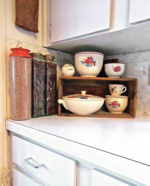
When a counter ends with an abutted or attached vertical wall, there is an abrupt visual halt. This can create a bit of anxiety. When something is placed in that corner, the visual direction has been softened. Rounding the corner enhances flow.
 To reverse the situation, eliminate the end vertical wall and the counter ends without obstruction, an over-the-edge-factor. If something, let’s say a coffee maker, is placed at the counter corner, anxiety is created.
Items should not be placed close to an open edge. Bring it in with a little breathing space. Everyone will feel more comfortable.
A kitchen island is also a working counter with corners, and the same design principles apply.
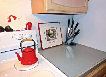
 The kitchen has work surfaces where tools and items are used on a continuing basis. It would be practical to leave some of these items out on the counter. But not too many items; that could border on clutter, which brings in anxiety again.
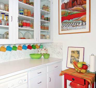
Properly use those kitchen counter corners and have fun. The corners could be a little display area for art, antiques, flowers, a practical breadbox; this is also where color accents could be displayed.
Remember, a kitchen counter corner is a steadfast, permanent arena. What is put in that corner can change daily — or remain empty for that matter.


