 Don’t forget to look up. There are spaces that we never knew existed. There are ledges and ceiling corners that call our names and are saddened to be unnoticed voids.
In this day and age, interior living space is at a premium for a lot of reasons, but primarily a matter of practical economics and impractical accumulation.
Even the most minimalist environment has “things” and many of those things are valuable art and antique pieces, “things” that can’t just be bagged up for a thrift shop donation or relative force-me-down.
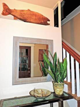
 Let me share a few ideas. Most obvious is the space some have between the top of the cupboard and the ceiling. Designed well, it allows the viewer to visually travel the room, bringing in colors or textures. It may be just one interesting item, a collection or an array of seasonal flares that are perched way up there.
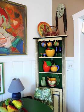
 Another up-high place that is forgotten is the top of a corner cabinet. I have seen many a cabinet loaded with dishes but nothing on that very top area that is often behind a decorative trim face. Let something flail up.
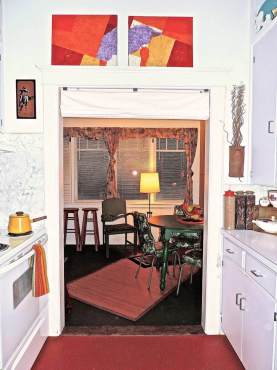
 There are many older houses around that have aggressive interior trim and high ceilings. Some doorway moldings are deep enough to create a ledge that will comfortably display art, kitchen trays or books leaning against the wall.
Just remember that any time you display anything of weight or breakability that high, attachment to the wall is also suggested.
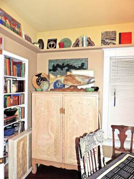
On the subject of deep molding: In many situations, a shelf can be created. This is a good idea for book collectors.
When older homes are remodeled and passageways diverted, it is an excellent opportunity to look up and see where shelves or recesses can be established.
Oh yes, the dusting and sanitary conditions of establishing out-of-reach areas. Solution: A long-handled dust buster and contemporary heating and air conditioning systems.
Aesthetics takes priority, sometimes.


