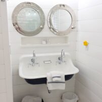
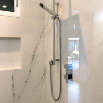
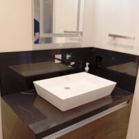
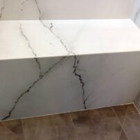
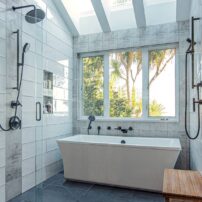
 These pages of brilliant baths are filled with inspiring ideas (and incredible photographs) that will have you rethinking the form and function of your own baths. We’re highlighting styles ranging from quiet and modern to timelessly traditional. But, they all have one thing in common — luxurious touches that turn a simple bathroom into a private escape.
 A Modern Bath in A New Dream Home
Alinda Morris Interior Design
Photography courtesy Matthew Witschonke Sound Photo Graphics
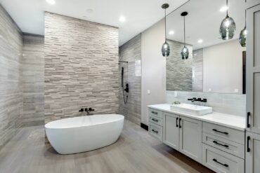
This was a new construction project for a dream home. The owners had a traditional home previously and were excited about doing something quite different — a modern home. They had a set of plans, but they were overwhelmed by the layout and had not selected finishes. New construction offers an opportunity to select everything at the same time, but the choices are endless and can be overwhelming.
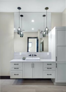 They enlisted Alinda Morris Interior Design to assist with all the details, including tile, flooring, countertops, plumbing and lighting. The team at Alinda Morris Interior Design likes to get to know their clients so they can create a space that feels personal and has all the amenities for the way the clients want to live. The Franchini Design Group assisted in the construction process.
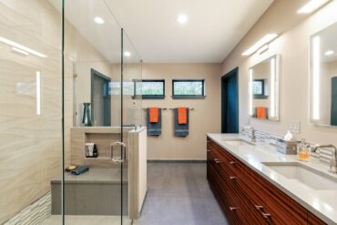
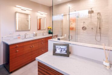
The finish selections create a cohesive, warm, modern master bath retreat that truly reflects the clients’ personal style. The master bathroom is beautiful, modern and sophisticated.
The owners are incredibly happy with the results. The master bath is a calming retreat — no vacation necessary. The layout of the space is their favorite part, creating some great sight lines. The architect did a great job. The challenge was to create definition of space and continuity in such a large bathroom.
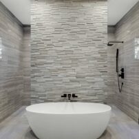
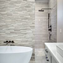
The shower is stunning, and the tub created the perfect focal point for the room. To emphasize that detail, the tile goes up the entire wall behind the tub. The design is anchored by a calming color scheme.
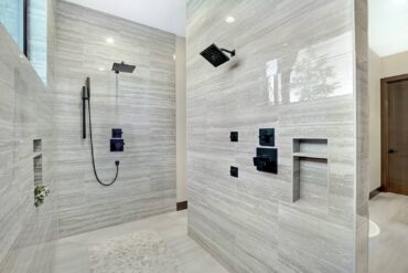 When planning a space like a master bathroom, interior designer Alinda Morris recommends starting with the layout and considering how you want the space to function and what your circulation patterns are. What is your focal point? How will the space look and feel in different lighting? Once all the foundational aspects have been considered, then move on to the colors and finishes.
Resources:
- Interior design | Alinda Morris Interior Design
- Architecture and construction | Franchini Design Group
- Plumbing | The Fixture Gallery
 Modern and Fresh Universal Design
Demane Design, LLC
This new bathroom space used to be two rooms. One was a tiny bathroom with a 30-by-30-inch shower, and all the plumbing fixtures were in dark chocolate brown. The adjoining room was a separate sauna that didn’t work.
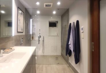
The homeowners wanted to combine the two rooms for a spacious new bathroom. One of the priorities was for the shower to have a curbless entry and accommodate a wheelchair with universal design. Getting down to the details, they wanted to make sure that the bathroom would work for everyone. There are also adjoining rooms, a suite that could be accessible for someone with disabilities. The suite consists of a bathroom, bedroom, bar/kitchen and living room. Working with Nancy Finneson, DeMane Design, the plan began.
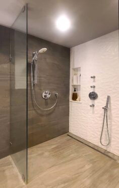 The combined rooms created a long, somewhat narrow room, but it could accommodate the clients’ needs and wants. The shower is a very generous 72 inches wide (as wide as the room) and is 45 inches deep, amble space for a wheelchair.
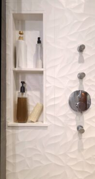 Since the bathroom would be used by others as well, some additional features were added. In the shower, a versatile shower bar with a hand-held shower works for tall, short or wheelchair-bound bathers. There is also a low hand-held shower spray for all to use. An additional feature is three body sprays to massage the neck, back and hip. All the water features can be used separately or at once.
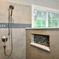
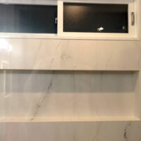
A tall niche can hold soaps and shampoo, reachable high and low. The bathroom didn’t have any natural light or ventilation previously, so a window was installed. The window has a second, deep sill, which serves as additional space for needed items.
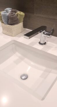 The bathroom floor has large-format, skid-resident tiles. In the shower, a long linear drain was used. Blocking is in the walls throughout the shower and bathroom in areas that may require grab bars at a later date. One wall is also prepped for a drop-down seat, if so desired. When using glass panels or glass doors, you need to make sure a wheelchair can fit through the space. In this bathroom, a nice wide glass door will accommodate that need.
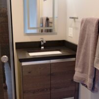
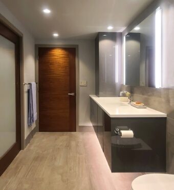
The vanity cabinet is floating, providing space for wheelchair access, but also giving the room a more open feeling. A tall cabinet sits on top of one end of the cabinet for linens and other items. It also has an outlet inside for optional items such as an electric toothbrush or water pick. The top drawers on either side of the sink both have power inside for a shaver or hairdryer.
The floor is heated throughout, keeping it cozy. It also helps dry wet spots on the floor faster. A wall-hung toilet was used to save space. It also has a washlet seat.
Lighting was placed throughout with dimmers. Since the homeowner didn’t want scones, a lighted mirror was used. It has vertical LED light bars at each end, giving even light when putting on makeup or shaving. A nice extra, LED strip lighting under the vanity base is controlled by a sensor and goes on automatically when someone enters the bathroom. An etched-glass pocket door gives access to the bedroom and lets in natural light.
 The bottom line, it’s a lovely bathroom to be enjoyed and used by everyone. The owners don’t have a favorite part of their new bath — they love it all.
Resources:
- Design and product specification | DeMane design, LLC
- Contractor | McHugh Contracting
- Cabinetry | Hyland Cabinetworks
- Plumbing fixtures | Ferguson Bath Gallery
- Electrical fixtures | Crescent Lighting
- Tile | Contract Furnishings Mart
- Tile installation | Harbor Custom Tile
- Countertops | Works Granite & Stone
- Shower glass | Harbor Custom Glass
 Dated Bathroom Goes Contemporary
Designs by Envision
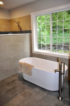
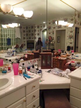
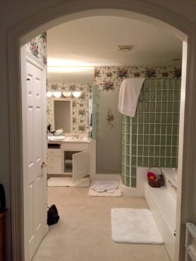
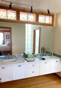
The bathroom of this home needed a refresh. The walls were covered in dated floral wall coverings with 4-inch matching tiles. The jetted tub was never used. The vanity’s finish was peeling away from the form, looking cheap and worn. Carpet on the flooring had a dingy look.
 Some tile was breaking away from the wall and the homeowner was concerned about a leak or water damage. With this in mind, interior designer Catherine Shively designed a whole new bathroom with everything new, from surfaces to hardware and lighting. All these upgrades transformed the master bathroom into a totally different space. Builder TJ Craig worked on the project.
The project wasn’t without challenges. First problem was discovered during the demolition: The old shower glass wall was built over the window trim. With the remodel the window trim and shower wall are situated with a finished look. The second challenge was with the tub plumbing, following the discovery that there were two foundation walls, which interfered with the plumbing for the new tub. But with some critical thinking and placement of the stand-alone tub, the plumbing was installed as planned.
The changes included:
- Replacing the old wall covering with new wall board for tiling and painting
- Removing the carpet throughout the bathroom and replacing it with heated floor and tile
- New vanities and plumbing fixtures
- Updating the trim for the large, wall vanity mirrors
- Replacing the jetted, built-in tub with a freestanding tub
- Replacing the vanities with new cabinets, sinks and faucets
- Replacing the vanity lighting
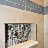
- Updating the shower area with new tile and shower fixtures, along with wall niches and a small seat
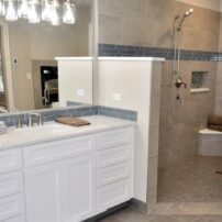
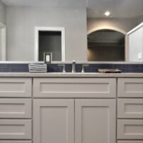
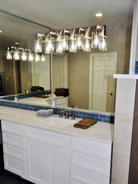
 The interior has a clean, contemporary look and organic colors. There’s a warm blue tile trim around the vanity and shower area, introducing a color accent to set off the bathroom and frame it nicely. Based on the client’s desire to keep the space simple, Shively selected the materials that have an organic feel and provide warmth.
The new bathroom is completely different, and the owners love it — especially the shower area and the heated floor.
Resources:
- Interior designer | Designs By Envisions, Catherine Shively
- General contractor | TJ Craig
- Cabinetry | Gray Lumber Co.
- Sinks, faucets and shower fixtures | Kohler
- Freestanding tub | Imler
- Plumbing | Daltile
 Old World Aesthetics meets Modern Functionality
MD Design Group
Photography courtesy Joe Kunesh Photography
This was a builder spec home that had thoughtless details. These included an oversized and awkward-to-use bathtub, minimal storage, a closet with a large section of unusable space and a very small shower that didn’t support aging in place. The finishes were average and bland. The homeowner really needed a master bath that could support her long-term needs.
Michele Doyle of MD Design Group provided the design. MD Design Group created a vision that spoke to the client’s love of Europe, maximized her storage and will allow her to use the entire space as she ages.
 General contractor Aguilar Construction Services followed the designer’s plans to a T. During the demolition, the builder found an area where water was penetrating the framing and fixed the root cause of the issue, treating the wood and reinsulating.
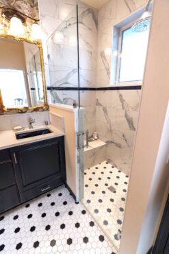
A very thoughtful closet design now allows the homeowner to store all of her clothing and accessories in one place. Converting her small shower into a large linen closet provided excess storage for both the bedroom and bathroom. Removing the bathtub in favor of a walk-in shower with a bench will allow her to use her bathroom with dignity for many years to come.
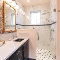
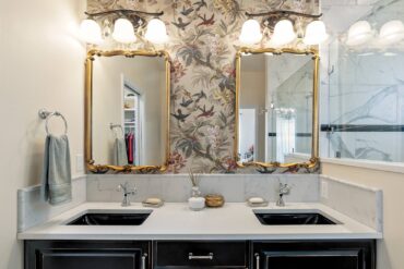
The client has had a love affair with old European design for years, Paris in particular. Doyle took cues from the client’s travels and some of the items she collected over the years, and created an aesthetic that spoke to the homeowner. Romantic and dramatic materials were selected, such as black contrasting with white.
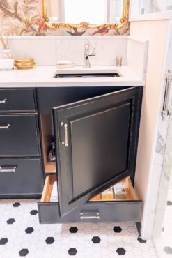
The linen closet was planned as a built-in cabinet to match the vanity — distressed black. Instead, they opted for a linen closet and repurposed the door and painted it black. That’s become one of the client’s favorite features, along with the wallpaper on the sink wall.
 “I am ecstatic with the remodel,” the homeowner said. “It combines my love of Old World aesthetics with modern functionality.”
The homeowner’s favorite parts are the zero-entry shower, bench seat and rain shower head. She also loves her new closet configuration. “For the first time ever, I have room for my entire wardrobe without having to switch things out seasonally,” she said.
“I wish I had undertaken this project sooner,” she added. “It’s never easy to undertake a major remodel. It’s messy, noisy and inconvenient, but working with the right designer and construction team alleviates the worry that it will be done right and that you’re going to love the end result. ”
Resources:
- Interior designer | MD Design Group, Michele Doyle
- General contractor | Aguilars Construction Services
- Electric | Foss Electric
- Plumbing | Economy Plumbing
- Countertops | Creative Countertops, Inc.
- Cabinetry | Copperwood Manufacturing
 A Spa-Like Experience
Bethany Reilly Interior Design
Photography courtesy Kelvin Hughes Productions
When Ann and Bernie Conley retired in their Bainbridge Island home, they knew they needed an extensive remodel. They wanted to expand the size and functionality of their main bath and give a full update to their powder room. It was an investment they were ready to take to ensure comfort in their retirement years.
Bethany Reilly Interior Design provided interior design services and builder Joel Pacheco with First Home Services provided full construction services, from demolition all the way through tile installation and paint. Pacheco spent almost 10 months renovating numerous areas throughout the house.
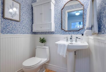 The floor tile was a main focus for this beach cottage, Scandinavian style home. First selection was a cement tile to incorporate the blue and yellow shades the homeowners were drawn to. However, the contractor was hesitant, as cement tile can easily chip and needs to be resealed periodically. Reilly found a beautiful Arizona Tile ceramic tile that was exactly the right size.
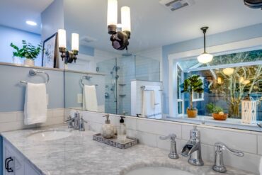
The clients requested a specific waterfall style for the faucets. A mix of metals was used — polished chrome plumbing fixtures, oil-rubbed bronze lighting and cabinet hardware. The quartz on the tub surround and accent details was selected to blend with the color scheme, but also give some contrast to the white subway tile and tub insert.
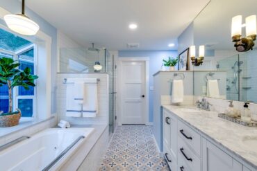 This project has been on the homeowners’ mind for many years and they are thrilled with the end result. Not only is the space more open and functional, but also just the right aesthetic look they were hoping for.
The floor tile is their absolute favorite. The pattern gives interest and a punch of color while still creating a soothing bath experience. They also love the custom Sherwin Williams paint color that gives this space a beach cottage feel against the white trim.
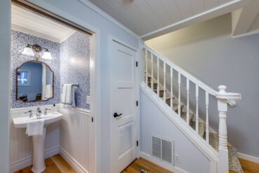 Bathroom remodels can sometimes be tricky, depending on the age of the home. In older homes inadequate plumbing can cause water leakage and damage. This can add time and money to a remodel, so Reilly always recommends being prepared for potential surprises. If everything is intact, a qualified contractor and designer can help to create a retreat, spa-like experience in your own home, she says. If budget allows, you can go a step further and add steam to your shower, a sauna and even integrated lighting to slowly brighten while you prepare for the day. These homeowners no longer need to travel to a spa for a relaxing experience right in their own home.
- Interior designer | Bethany Reilly Interior Design
- General contractor | Joel Pacheco, First Home Services
- Electric | Advanced Electrical Design
- Plumbing | Bronson Plumbing
- Solid surfaces | Creative Countertops, Inc.
- Glass and mirror | August Glass
- Powder room wallcovering | Schumacher
- Wallcovering installation | Pacific Wallcoverings, Inc.
 Vision Achieved with a Dream Team
Creative Countertops, Inc.
The guest bath in this home didn’t have a good layout and the master bath didn’t function well. The kitchen had been recently updated, and the homeowners wanted the bathrooms to have the same feel — bright, modern, nautical-themed and functional spaces.
The owners chose all the contractors and trades themselves, with Creative Countertops as the main contractor. The couple was pleased with their dream team of professionals.
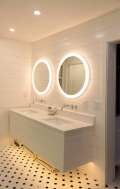 Creative Countertops and the rest of the team implemented the homeowners’ vision of the design.
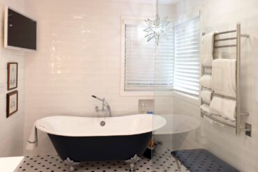
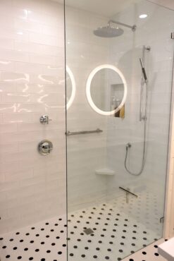
They expanded the guest bath to have a double, wall-mounted, navy-and-white Kohler sink. The toilet was moved to a better location. The bathtub was removed and a zero-threshold shower and floor system, complete with glass panels, was installed. The new tile is classic navy and white.
 The oversized, built-in tub in the master bath was replaced with a free-standing navy-and-white slipper tub. A floating vanity replaced an outdated double vanity. Kohler wall-mounted faucets free up the white quartz countertops.
Walls were either tiled in a white subway-type tile or in a crisp white (Simply White by Benjamin Moore) shiplap. Classic navy-white, penny-type tile replaced a tired molded-plastic shower floor.
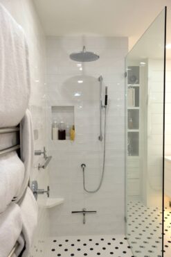 Both bathrooms now have the zero-threshold floor system with minimum glass panels. The feel for a small space is open and bright, with a classic nautical motif. The Moravian-Star (Shades of Light) light over the navy-white slipper tub, hanging TV and heated towel bar system give the bathroom a spa-like ambiance.
The owners chose all the materials with help from Pinterest, Signature Hardware, Kohler and Ferguson Plumbing. They’ve built or remodeled over a dozen previous homes, and relied on the experience gained from those past endeavors.
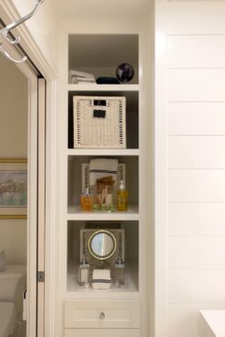 They’re beyond pleased with the end result, even though they spent more than budgeted for the project because they wanted the end result to be just right. The couple loves the unique look in both bathrooms. The floating vanity, lighted mirrors, Kohler Purist wall-mounted faucets and the navy-and-white cast iron slipper tub really make a statement in the master bath. They also absolutely love the clean look of the zero-threshold navy-and-white tiled floor and shower with the partial-glass enclosures.
Resources:
- Main contractor and tile installation | Creative Countertops, Inc.
- Plumbing | Mabbut Plumbing
- Electrical | Matthews Electric (lighted mirrors and undercabinet lighting)
- Finish carpentry | Britt Nyman (shiplap, floating cabinet, double-sided mirrored barn door)
- Glass installation | August Glass (glass partitions and mirrored barn door)
 A Surprising and Delightful Transformation
Bloom Design Group
Photography courtesy Julie Mannell Photography
The owners purchased this home from the estate of a dear friend, who built it in 1991 and lived alone there until his death in 2014. His passion in his later years was composing and recording music; he had little time or interest in maintaining his home.
The home was originally designed to meet the needs of a bachelor and the master bath was a dismal and outdated space that lacked any connection to the character of the architecture or the land. There is a stunning view off the private side of the house and the master suite took no advantage of it. The space was also dysfunctionally organized, with no allowance for privacy.
 General contractor Glen Haines of Custom Haines Construction Inc. introduced the homeowners to interior designer Cheryl Bloom of Bloom Design Group, who created the interior architecture and design concepts. Their long-term relationship added much value to the project and the possibilities were made larger by their differing strengths and experiences.
Bloom notes that Haines was amazing to work with and brought a wealth of construction knowledge and a great crew of subs to the table. His experience was key to solving hard issues as they arose, and the outcome shows it.
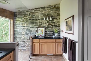
Bloom rose to the challenge to plan the space. The entire bathroom was gutted and reorganized around a new, large, two-person shower with an even larger window that takes in the sweeping views of the valley below and the hillside beyond. Bloom created a functional space that separates the vanity into “his and hers” at the homeowners’ request and carved out space to include a water closet for privacy.
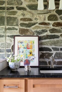
She selected the materials with the test of durability in mind. Equally important, they all needed to speak the language of the home’s architecture and connect with the lush land it sits upon. The fieldstone used inside the shower and behind the vanity is specially treated for use in a wet space. Together with the floor tile, which looks a lot like bark, it makes a beautiful visual connection to the outdoors.
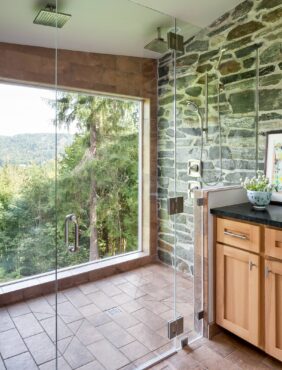 Dark, plain quartz in a matte finish was used for the vanity tops and the plumbing fixtures were kept discrete so they would not distract. All of the thoughtful selections of natural and comfortable finishes make one feel very connected to the land and is in unity with the rest of the remodeled home.
The homeowners were surprised and delighted by the transformation, and feel their home is now timeless. Their favorite part is the comfortable connection to their land and sense of “handsome casual” — because that reflects how they live.
Resources:
- Interior architecture and design | Bloom Design Group
- General contractor | Custom Haines Construction (including custom-built hickory cabinets, tile and stone work, drywall, painting, finishing, millwork and flooring)
- Soap stone countertops | Western Tile and Granite
- Electric | Onsite Electric Co.
Dated Bathroom Becomes Luxurious Spa
Creative Countertops, Inc.
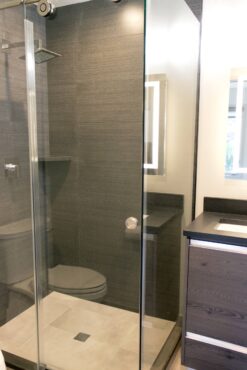
The homeowners did a full-house remodel after purchasing the home in 2018, but the existing bathrooms were stuck in the ’80s. The wanted clean lines and a modern look — so everything was replaced. Space limitations dictated the design.
 They chose Newform Kitchen Design, located in Anaheim California, to design and build the modern, European-style cabinets. All the bathroom cabinetry was built in Anaheim and shipped directly to Bainbridge Island. Every frame, drawer and cabinet came numbered with explicit instructions so it could be installed, piece by piece, by the local crew from New Star Painting, who both installed the bathroom cabinets and painted the interior of the home. Ocean Electric installed the lighted mirrors and can lights.
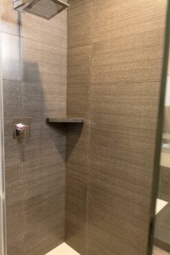
Creative Countertops of Poulsbo installed the quartz countertops, as well as the thin-slab porcelain shower surrounds in the master and secondary bathroom. The thin slab is very labor intensive to install and must be done with a deft hand so it doesn’t shatter, and the porcelain distributor recommended Creative Countertops for the job.
The new flooring is 12-by-24 ceramic tile, which extends into the curbless shower for a seamless design.
The homeowners are very happy with the results. Their favorite part of the new bathroom is the rain shower heads — they look great and truly make them feel like they’re in a luxurious spa. They were especially impressed with how all the trades worked side by side throughout the course of the project — this cooperation added to the dimension of the quality the owners desired.
 Industrial Glam with a Northwest Twist
Kitsap Kitchen & Bath Co.
Photography courtesy Joe Sean Byrne
The owners purchased the home with the intention of remodeling to make it their own. Built 30 years ago, the home had original finishes that were severely dated and not the owners’ style.
Kitsap Kitchen & Bath Co. was hired for design, project management and renovation services. Lead designer Natalie Collins Shaw constructed the designs and plan, consulted the client on material and fixture specifications and offered design support to project managers Randy Torres and Lacey Collins.
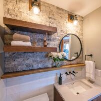
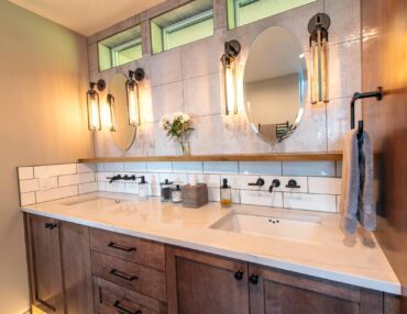
The powder room received cosmetic upgrades, including new custom vanity, Cambria quartz countertop, wall-mounted faucet, new Kohler comfort-height elongated toilet, classic large-format glazed ceramic wainscotting, live-edge walnut ledge, floating shelves, stacked-stone accent wall and wall sconces.
The master bath had extensive upgrades, which ranged from new custom vanity and new fixtures to lighting. The glass block windows above vanity were upgraded to picture windows and the toilet location was changed to a newly framed toilet closet. Various pieces were removed, including the wall separating the vanity from toilet and shower, the glass blocks at the shower entry and the curbed shower pan.
The shower was changed to zero threshold entry, and a therapeutic, warm and cozy and spa-like experience was created with the help of rainhead, hand showers, body sprays, freestanding tub, teak bench, heated towel bar, heated tile floor and dimmable accent lighting.
Industrial glam with a Northwest beachy twist was the inspiration for the design. Bringing together wood, metal and stone was key in achieving this look. Using different textures and mediums created visual interest in this space.
The warmth and organic nature of the live-edge walnut balances modern, clean lines of matte black Kohler “Purist” fixtures. The large-format porcelain tiles used on the accent walls speaks to that industrial modern feel, and with just a touch of sparkle, adds depth and a sense of wonder.
The owners said their favorite part of the new bathroom is the spa-like feeling of the whole thing, warm and calming. They also love the upgraded and therapeutic wetroom, complete with dual showers, rainhead, handshowers, body sprays, curbless threshold and gorgeous freestanding tub. The wetroom was planned with universal design in mind. They are spending a lot of time in their newly renovated spaces.
Resources:
- General contractor | Kitsap Kitchen & Bath Co.
- Trades | Swift Plumbing, Sunset Electric, Olympic Hardwood Floors, FloForm Countertops, Kitsap Custom Coatings, Halady Unlimited, NW Tile & Stone
- Fixtures and materials | Mir Mosaic Tile, Bedrosians Tile, Cambria Quartz, Kohler, AMBA, Resoration Hardware, Canyon Creek Cabinetry, Schluter Systems, Systematic Supply, Edensaw Woods
 From Bland to Dramatic
MD Design Group
Photography courtesy Joe Kunesh Photography
Debra and Paul Vaughan have been steadily remodeling their home for several years and it was down to the bathrooms. The home is gorgeous, beautifully situated and high end, but the design for the master bath was inefficient and choppy, and the level of finishes didn’t align with the rest of the finishes in the home after all the other upgrades were made. Additionally, the cabinets, countertops and fixtures didn’t appeal to the couple’s aesthetic preferences.
 The master bathroom included an oversized tub that the water heater couldn’t fully fill with hot water, and the shower was very basic. As in the rest of the house, the powder room was also basic and didn’t match up to the quality of what it should be in that house. Given that the powder room is something that everyone sees, Debra Vaughan wanted it to be dramatic.
Aguilar Construction Services had been working with the Vaughans from the very beginning, so the company understood the work environment and was already familiar with the family’s lifestyle. The contractor did a marvelous job of protecting the job site, particularly the areas where they had already remodeled. Aguilar also brought on board trade professionals who understood the architecture of the home and how to make the changes called out by the designer to achieve their goals.
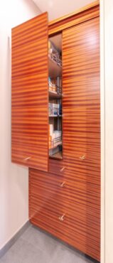
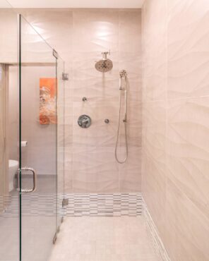 Michele Doyle of MD Design Group created the design, including a water closet with a full-height storage cabinet. The application of tile on the outer wall of the water closet gave the illusion that the bathroom was actually bigger than the original footprint, even though the addition of the wall made the bathroom smaller.
 The tub area was converted to a full, walk-in shower with a beautiful bench and niche. Tile wrapped from the shower around the room blurred the definition of where the shower started and finished. Clever storage was designed into the custom cabinetry.
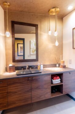
To create a more modern space in the powder room, the vanity was designed to float above the floor. Because the outer wall and ceiling were curved, an asymmetrical design was used to accentuate the curves rather than try to mask them. This unique architecture allowed for creativity with finishes as well. The acacia wood flooring was replaced with a beautiful porcelain tile.
The Vaughans’ home is more modern, so the original transitional finishes in gold and maple were replaced with spa-like modern textures and details. The Sapele cabinets added energy and excitement to the space, along with a dynamic original painting by Shirley Sakatani.
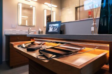 The polished nickel finishes for the faucets were a continuation of the finishes from upgraded lighting and fixtures in previous remodels in other areas of the house. The tonal qualities of the finishes are meant to calm while the vibrancy of the cabinetry, door color, trim and art add energetic tension. Heated tile flooring, in-cabinet electrical for charging devices and up/down sconce lighting paired with lighted medicine cabinet leverage the latest technology for a fully equipped bathroom.
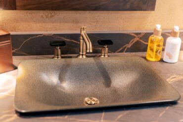
In the powder room, the designer and the homeowners were inspired by a beautiful, gold, hand-painted wall paper sample from SJW Studios in Port Orchard that was installed on the back wall and arced ceiling by Marci Blackney. The custom-designed walnut cabinetry was built by JSG Fine Cabinetry in a similar design to the kitchen. The Shagreen Kohler sink played beautifully with the Dekton Laurent countertop. The brushed gold lighting coordinated well with a faucet with the same finish — with the hot/cold water controls capped off by black emerald shaped crystal.
The homeowners love their remodels. In the master bathroom, they love the functionality that doesn’t sacrifice beauty. The new water closer was a great addition, as well as the storage cabinets in that area.
“I love the wall tiles and the beauty of the wood cabinets,” Debra Vaughan said. “Paul really likes his charging station and uses it every day.”
She adds, “The powder room is beautiful with a very dramatic look. The lights and wallpaper are unique and the sink really sets off the countertop material.”
Resources:
- Interior designer | MD Design Group, Michele Doyle
- General contractor | Aguilars Construction Services
- Plumbing | Economy Plumbing
- Countertops | Creative Countertops, Inc.
- Cabinetry | JSG Fine Cabinetry
- Wallpaper | SJW Studios
- Wallpaper installation | Marci Blackney
 Edgy and Luxurious
Kae Rosenberg Interior Design
This townhome was built in the late 1990s. The space was dated and the master bath had a reoccurring leak under the spa tub. The homeowners gave the interior designer, Kae Rosenberg with Kae Rosenberg Design, free reign, as long as it was within their established budget. All they asked Rosenberg to keep in mind was a future resale of the property. Rosenberg also acted as project manager.
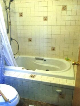
The old spa tub and surrounding tile were removed, the leak was repaired and the subfloor was replaced as needed. Instead of installing a new tub, Rosenberg decided on a beautiful, ADA-compliant walk-in shower with a corner bench, a double niche and a European-style glass panel. A new Grohe Thermostatic Mixer shower with rainfall and hand-held was added.
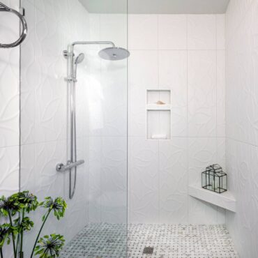 A sleek, edgy, matte white, 13-by-39-inch embossed tile was applied vertically to the walls and is reminiscent of an Anaglyptic wallpaper. For the shower bed, Rosenberg juxtaposed this contemporary tile with a beautiful Calcutta Gold Honed in a 2-by-2-inch classic basketweave mosaic. The overall floor of the bathroom is a 12-by-24-inch ceramic tile in the color Papyrus, replacing carpet.
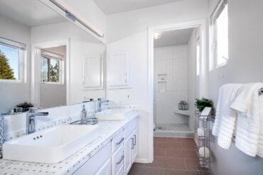
The existing vanity remained but was painted it white. The sinks were switched out and ADA-compliant lavatory fixtures, new vanity hardware and lighting were added.
The space needed a visual punch, so Rosenberg decided to deviate from installing a slab, solid surface on the vanity. She loved the Calcutta Gold mosaic shower floor so much that she decided to use it for the vanity countertop as well. The basketweave pattern reminded her of a plaid and now she absolutely loves it. It keeps the overall space from looking too staid and gives it the touch of luxury that it needed. It was also quite a bit less expensive than using a stone or quartz slab.
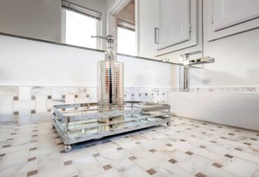 Rosenberg had a specific vision of how she wanted this project to evolve. She wanted the overall design to be current — a little edgy but luxurious. It was also important to make sure it would stand the test of time. Color-wise, she stayed with whites and neutrals, giving the space a sense of timelessness.
The owners love their new bathroom and were happy Rosenberg was able to stay within their budget. Their favorite part of the bath is the shower.
Resources:
- Interior designer | Kae Rosenberg Interior Design
- Demolition and tile work | One Crown Flooring
- Plumbing | Collier Plumbing
- Tile | Pental Tile (supplied by Contract Furnishings Mart)
- Vessel sinks | Kohler
 A Long-Awaited Master Suite
Demane Design, LLC
The homeowners wanted to do a master suite remodel for over 20 years. Literally everything needed to change. They were looking to convert a fourth bedroom area into a walk-in closet and to enlarge the bathroom to include a luxury shower. The new suite would encompass three rooms.
Starting with a down-to-the-studs rip-out, walls, a window and doors were moved. The new spa bathroom footprint was increased by 50 percent. The seldom used bath tub was removed, allowing space for a luxury shower.
 The walk-in closet (which used to be a bedroom) is now customized to their needs with lots of hanging and drawer storage. The bedroom feels large and roomy, as it’s the center of the suite. The new plan also brought in grand double doors with obscure glass for both the bath and walk-in closet, which allowed for privacy while filtering in light.
Relocating a window, moving walls and doors started the framing layout. Plumbing fixtures were the first to be selected. Waterfall faucets for two undermount sinks are fun and functional. The shower has a slide bar for easy height adjusting with a multifunction showerhead.
A teak seat the full width of the shower is comfortable and has a hand-held spray within hands’ reach. A wall-hung toilet is located in a private alcove and it’s all set up to accept a washlet seat, to be installed at a later date. The alcove also has a recessed cabinet that is always well stocked with TP and other necessities.
One of the homeowner’s favorite things is the heated floor, fabulous for cool mornings. One of the more luxurious must-haves for their remodel was to have heated towel bars. They have two so they don’t have to share.
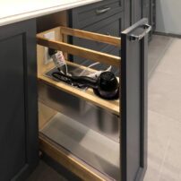
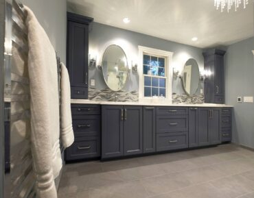
The vanity cabinetry has ample space with nice, deep drawers for towels. It also has two pull-outs, one with a caddy with power for a hair dryer. At either end of the vanity, tall countertop cabinets hold all those items you want handy. In the bathroom, a linen closet was incorporated. It has a mirrored door giving the room a grand feeling.
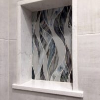
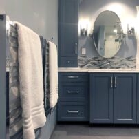
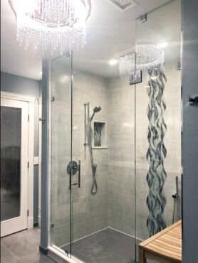
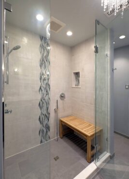 One thing you notice when you first enter the room is the amazing accent tile. In the shower, you see, floor to ceiling, an accent of color and shape swirling gently in blues and subtle grays. It also accents two niches in the shower — and again, they have “his” and “hers” so they don’t need to share. The swirling tile was also used for the vanity backsplash.
Lighting in any space is important, and ambient and task lighting was placed in all the right places. For fun, whimsy is at play. Crystal chandeliers are in the bath, bedroom and walk-in closet. Why not smile every time you enter a room!
The homeowners acted as the general contractor and performed most of the work themselves, exclusive of tile, shower glass, cabinet, countertop and drywall installation. They worked with Nancy Finneson, DeMane Design, from start to finish. She was terrific with the design plan, selection of materials and fixtures and working with subs. The end result fits the needs and is functional and beautiful.
The heated tile floor tops the list of the owners’ favorite aspects of the new bathroom. But they also love the shower, the heated towel racks, the pull-out hair dryer drawer, the lighting and — well, everything else.
It may have taken 20 years to get their dream space, but it was well worth it. Now every day, they enjoy their new, long-awaited master suite.
Resources:
- Design and product specification | DeMane design, LLC
- Cabinetry | Hyland Cabinetworks
- Plumbing fixtures | Ferguson Bath Gallery
- Electrical fixtures | Crescent Lighting
- Tile | Contract Furnishings Mart
- Tile installation | Harbor Custom Tile
- Countertops | Orca Granite & Stone
- Shower glass | Harbor Custom Glass
 New Bath with a Crisp Design
Above And Beyond Custom Tile And Quartz
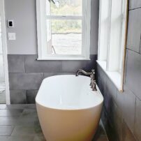
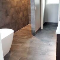
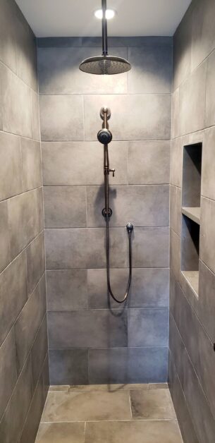
The homeowners decided they wanted a super-clean and crisp design for their new construction home. Above And Beyond Custom Tile And Quartz came up with a plan featuring a curbless entry with an infinite Schluter linear drain to give it a unique, hidden look.
For materials, the contractor chose a Schluter system to ensure a shower that’s completely waterproof and has a 100 percent vapor barrier. The homeowners loved the floor heating idea, so the builder installed the SunTouch heating matrix and wire throughout the floor to keep their toes nice and toasty.
For the tile, they selected top-end “smoke gray” 12-by-24-inch porcelain from Italy. A piece of Cemento quartz from Cosentino Brazil was used for the soap niche so as to use all of the space possible and keep the simple yet elegant look. Added is a tile base of the same 12-by-24 smoke gray porcelain cut to size, and all edges are wrapped in a Schluter trimline edging in an anthracite color that matched perfectly with the tile.
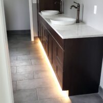
The tile is grouted with a nonsealing polyurethane grout, making the shower very low maintenance. A Misterio 3 cm quartz was used for the top of the vanity and under the vanity is a Flexfire waterproof LED especially made for bathrooms — and it includes a motion sensor so it lights up as soon as someone walks in.
Resources:
- General contractor | Above And Beyond Custom Tile And Quartz
- Plumbing | Western Plumbing


