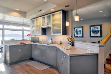
 A cozy Bainbridge Island townhouse complex backs up to one of the area’s many lovely water views. There, Molly McCabe and Clive Pardy, owners of A Kitchen That Works LLC, a Bainbridge Island design-build firm, transformed one couple’s home from a dated homage to the late 1990s into a modern space that takes full advantage of the home’s waterfront location.
After nearly two decades on Vashon Island, the homeowners were ready to relocate and downsize.
“We needed a little more city,” said one homeowner, “so we traded one island for another.”
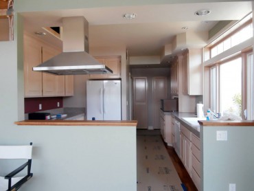
The townhouse had much of what the couple was looking for — a more manageable size for two and easy access to both local and Seattle shopping, dining and resources. However, the house, although it possessed an enviable location, did not fit the couples design sensibilities.
“We’ve always liked the contemporary look, with its clean lines,” the homeowner said.
The house, on the other hand, heavily featured design elements from the 1990s, from its square tile countertops to its light wood cabinets and brass fixtures.
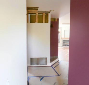
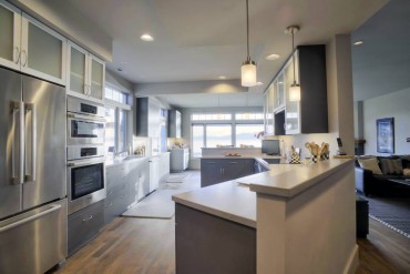 The space also failed to take advantage of the waterfront location. The double front door opened the wrong way, pointing guests toward the entryway’s side wall, and a full wall between the entryway and kitchen completely blocked the view from the entry of the home.
“When you came in the front door, you couldn’t see the water at all,” the homeowner said.
So, transforming this home into a contemporary waterfront retreat was not just a matter of repainting the mint and burgundy walls in the living room and freshening up the cabinets, countertops and fixtures. This project required some serious labor, from repositioning doors and bumping out walls to almost completely removing the original wall between the entryway and kitchen. Even the front door was rehinged, so from the moment you walk in the door, your eye is drawn to the view.
Work began in March 2014 and the couple moved in in September.
“There was some work to be done to bring the house up to code and we retained an engineer to make sure the changes we wanted to make would work with the structure of the house,” McCabe said.
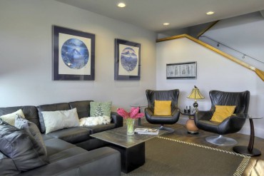
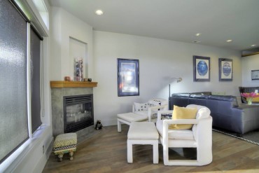
One of the most striking things about the home’s updated look is that nearly everything — walls, ceilings, cabinets and countertops — is done in gray. It provides for a distinct, contemporary feel, which is what the homeowners were after, allowing their colorful art collection to “pop.”
The color was inspired by an accent wall in a relative’s home that was painted San Antonio gray. The wife fell in love with the color and when it came time to plan the look of their new home, she and her husband were adamant about using that color throughout the home.
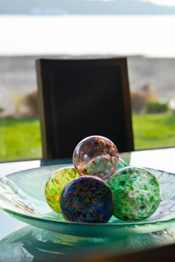 Of course, gray can seem overwhelming or dull, depending on the space it’s used in, the amount of light in the room and so on. To balance the gray palette throughout the home, McCabe used Benjamin Moore San Antonio gray with 100 percent tint in areas that get a lot of light during the day, and softened the tint to 75 percent in areas with less light exposure.
The home’s original cherry wood floors, which had turned bright yellow and orange from UV exposure, were refinished in a warm, gray-brown hue using an oil finish. The floor complements the gray palette, maintaining the contemporary look while adding warmth and depth to the space.
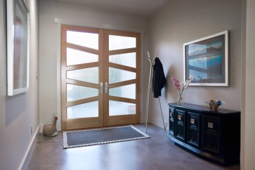
The space is the perfect size for two people. As you come in through the double front door — an impressive artistic blend of wood and glass — the eye travels past the spacious pass-through kitchen to the wall of windows in the back of the house that frame a small yard leading to the water.
“On the first floor, we changed pretty much everything,” the homeowner said.
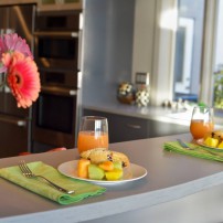
In the kitchen, the cabinet space was extended and the new Bosch appliances were rearranged to ensure good workflow and to further open up the view to the back of the house. Numerous cabinets with simple stainless hardware line both walls, and a generously-sized pantry with sliding doors of satin-etched glass dominates one end of the space.
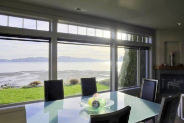
As you walk through the kitchen, a door to a private patio opens off to the left, and a glass dining table sits on the other side under the wide bank of windows. Past the table, a Milestone-faced (pigmented latex concrete material) fireplace sits in the corner leading into the living room space. A large powder room, complete with walk-in shower, and an office tucked in by the front door comprise the rest of the first-floor space.
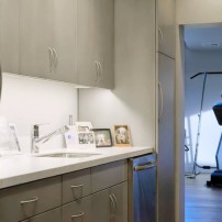
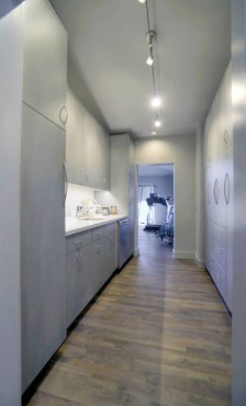
A wide staircase with wood accents that echo the hardwood flooring leads to the townhome’s second story, bathed in light from a large stairwell skylight. At the top of the stairs, a few steps forward takes you to the house’s original laundry room, which has been converted into a spacious storage area/entertaining bar, with nearly floor-to-ceiling cabinets — all gray — that utilize sliding pullout shelves and other features to maximize their usefulness.
“Moving from a bigger house, storage was definitely a concern,” the homeowner said. “Now I have all this fabulous storage.”
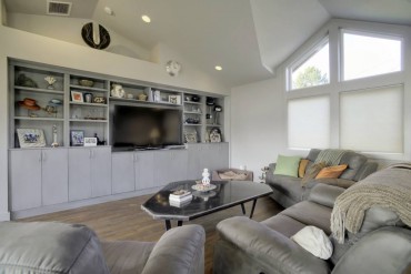
A countertop along one wall includes a sink and an under-the-counter fridge, which comes in handy when the homeowners are spending time in the large bonus room found on the other side of the walk-through storage room. Easily the largest single space in the house, the bonus room features a high cathedral ceiling and a custom, built-in entertainment center with plenty of cabinets and shelves that spans one long wall.
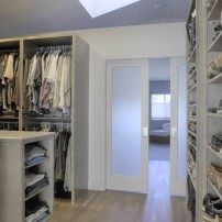
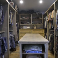
To the right of the stairs, double pocket doors lead into the master suite’s truly amazing walk-in closet. The close is large enough to be considered a room of its own and the walls are lined with both shelves and rods for clothes. There’s even a storage island in the center. Originally a wide vestibule-type space leading into the master bedroom, the closet was created by A Kitchen That Works by adding a three-quarter wall to the space, which seamlessly blends into the stairwell structure.
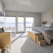
The master bedroom looks out onto the water through a bank of windows on the back wall. A single French door leads to a small Juliette balcony. The room’s original walk-in closet was converted to a laundry room, which leads to the master bath. Extensive work was done here, as well.
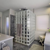
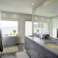
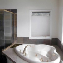
The original soaking tub was removed to add a makeup vanity and extra storage. A spacious, doorless shower framed in glass block stands opposite the bathroom’s double-sink countertop.
A guest room with private bath completes the second floor of the home.
Throughout the home, details large and small — from the perfectly blended gray palette to the lighted toe kick under the master bathroom sink — point to the hard work and attention to detail put into this project.
“Molly and Clive handled everything,” the homeowner said. “They just made everything work.”


